
Some art work we are likely to do alone, as little outside assistance is required: street photography, for example, or sketching wildflowers in the woods, or singing in the shower. Other types require support systems of various sorts: a string quartet or bronze casting. Artists frequently pool their resources to draw nude models, though they probably don’t to paint still lifes. Printmaking tends to be a form that brings people together: presses require a good deal of expertise, and besides, they are heavy, space-consuming, and expensive. Tiger Lily Press celebrated its 40th anniversary this year with a show that suggested something about the social environment it has provided for printmakers over the last four decades.
Though there are other printmaking workshops in Cincinnati (Clay Street Press, for example), Tiger Lily is distinct for the range of printmakers it is designed to serve. From its establishment, it has seen itself as serving established graphic artists who come to work on their own using the press’s equipment; practicing artists in other media who are new to printmaking, who can receive tutelage from more experienced graphic artists; and community members who, for a fee, can become members of Tiger Lily (now officially a non-profit) and receive instruction in various printmaking media. Once you are part of the Tiger Lily community, all you need to bring is plates and paper; Tiger Lily provides the rest.
From its founding in 1979 by Mary Mark, there was always something designed to be invisible about Tiger Lily. By and large, it did not commission portfolios, and does not edition prints. This makes it harder for an exhibit to tell its story through a progression of artworks, because there has never exactly been a designing hand, a tastemaker, lurking behind the scenes as the auteur. This absence contributed significantly to the lack of coherence from which the show suffered. The show was interested in telling the story of the press’s geographical peregrinations. Over the decades, it has occupied four spaces and nearly left town early on before its name and equipment were bought by a combine of concerned artists who found—for a brief period of time—a new home for Tiger Lily under the auspices of the Art Academy. It also documented its sequence of twelve or so directors who have remained true to the Press’s original vision of providing a home for printmaking rather than, say, a vision of particular sorts of printmaking. To be sure, there has been a range of significant decisions that the Press’s various leaders have made over these years, including bringing in a range of guest teachers (such as Thom Shaw), creating partnerships of various sorts, and, since 2012, a particularly fruitful residency program. But the anniversary show itself prefers to keep these things invisible, which I found frustrating. I would have been interested in Tiger Lily’s own self-assessment of what’s been gained and what’s been lost through its commitment to a combination of professional and amateur, experienced printmakers and those brand new to the media. What directions do its Directors think the press has followed—and in what directions have its participating members helped move the story of graphic arts here in Cincinnati?
Though the Press sets out its institutional timeline in more than one way, I would have been very interested in a timeline of the sorts of prints produced at its presses over four decades. In a show that consisted of four galleries, the show devoted one to Tiger Lily’s historical roots—the work of its first half dozen or so years. The remaining three were all very much contemporary. One gallery is devoted to the work of some of the artists who have been part of the residency program. The remaining two display work done by the mix of teachers and students, professionals and amateurs, for whom the Press has been intended from the start. While the show surrenders its capacity to have set out a story of recent printmaking, it succeeds in showing the work of many of the most important and interesting printmakers who have worked in Cincinnati over the years. If you like the look of the marks that define fine art printmaking, with their beguiling combination of distance and immediacy, you would have found lots to be happy about at the Kennedy Heights Center.

April Foster, “Garden II” (1985)
In its earliest years, Tiger Lily published three portfolios which helped set out some of what was most interesting about printmaking in Cincinnati in the 1980s. April Foster, one of the most accomplished of Cincinnati’s long-time printmakers and teachers, is represented by “Garden II” (1985). A profoundly sensuous nude woman, possibly a goddess, reclines among luxuriant flowers (and weeds), closely but idly examining the specimens in front of her. We can tell it’s a garden because three fragments of fencing are floating in the print’s sky; otherwise, we might think it is all wild and lusciously overgrown nature. With its clear and precise lines, it is an image in conversation with various forms of modern neo-classicism; the intricate patterning of leaves and stem seems on the verge of overwhelming everything else, including the figure.
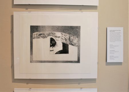
Jan Carmichael, “The Passenger” (1980)
The first room has some of the exhibit’s edgiest work, including prints from the C.A.G.E. Portrfolio of 1980. The Cincinnati Artists Group Effort (1978-1992) included many of the city’s most significant artists in virtually every medium who came as close as anyone could to creating a “Cincinnati look” in the closing years of the 20th century. It is hard now not to miss their shows and their energy. Jan Carmichael’s “The Passenger” (1980) was the outgrowth, we are told, of a photo-etching workshop at Tiger Lily. The print is more evocative than clearly narrative: a ghostly figure, wrapped, perhaps, like the Invisible Man, is riding shotgun in a car whose interior is barely discernible in a deliciously creepy image of possession or kidnaping or accomplices. It is a haunting—and possibly a haunted—image that suggests darkness, rain, and speed; it seems very distant from whatever were its roots in a photographic image. In the same room are examples from the Press’s two shows of Paper Dolls (2007 and 2010), which remind one (as do Jan Thomas’s sculptural vessels in a different gallery) of the enormous capacity of printmaking to evolve and challenge its own fundamental premises, including the production of two dimensional objects. Rick Finn, Tiger Lily’s Co-Director from 2006 until 2010 (with one other exception, all of the other Directors over the years have been women), contributed “Go Quickly My Miserable Friend” (2010) to the second Doll show. It features a flat, jointed mannequin, made from hand cut paper and topped with a photograph of a human head, who is driving away a bleeding skeleton, as if expelling it from paradise. Finn’s work elsewhere in the show consists of portrait (and self-portrait?) etchings with various techniques, but united in their intense attention to the laborious hand workmanship of traditional graphic arts. They capture much of the elegant look of fine art etchings in the late 19th and early 20th centuries, only more, well, creepy. (One of his recent images is called “Creep [3]”). In his arresting character studies, Finn plays with distracting us by adding a white neck ruff to a portrait bust, for example, in which his figure does not look particularly comfortable; elsewhere, he abrades the faces of his portraits so that they are practically erased. There are haunting suggestions in some of his work that he is, in some measure, an inheritor of some of the same adventurous, partly surrealistic sensibilities as the C.A.G.E. artists with whom his paper doll was shown.
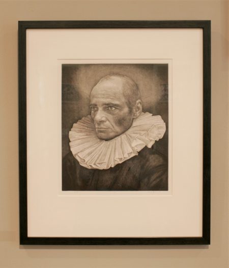
Rick Finn, “White Collar”
Some of the most remarkable works in the show were done by teachers in the region’s art programs. Andrea Knarr, who taught printmaking at NKU since the 1980s, has two ethereal landscape monotypes, making ghostly forms by the freehand manipulation of inks before running them through the etching press. Her “Waning Light” has some of the mysterious quality of a 17th century Hercules Segers woodcut (whose prints might as well have been monotypes). If her natural forms had any more spirit to them, they would float clear off the page. (Sheila Fleischer’s monotypes, by contrast, are as bright as Knarr’s are monotone.) Beth Belknap Brann was the Director of the Graphic Design Program at Mount St. Joseph since 1989. Her lithograph “Castle Batllo” (2018) captures the façade of one of Gaudi’s greatest buildings as it catches the light. Her sensuous drawing is in harmony with the swirling, swelling forms of the building.
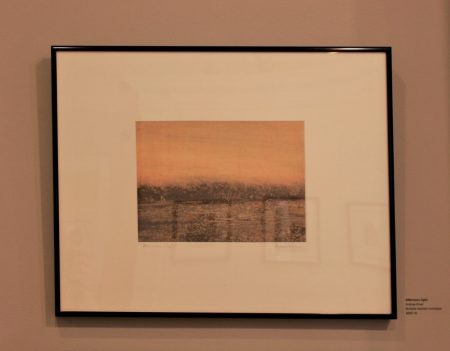
Andrea Knarr, “Afternoon Light”
In Saad Ghosn’s “Sunday’s Visitors,” three animals in a bare landscape underneath a sky filled with celestial objects as round and plentiful as an apple orchard approach a large circular shape. It might be a water hole; it might be an entrance to the center of the earth. All we know is that it has brought crocodile, quadruped, and monkey together in edgy peace with each other. In their uneasy détente, they exude liveliness in many forms; they are covered with stripes and spackled with shapes of all sorts. With their eyes firmly fixed on each other, they are separated by the large, circular thing that has brought them together. Vanessa Sorensen has a large linoleum cut with embroidery called “The Weaver.” Sorensen, who has training in both fine arts and zoology (and has published a book called Animal Jokes for Children), depicts two great, sensuous chrysanthemums, their superabundant petals waving about like tentacles. (If Posada has done giant relief prints of flowers, they might have looked like these.) At the center of one, she has embroidered a spider web; at the center of the other is a giant spider. Are they ready to catch the viewer who is drawn in by the extravagant sensuous appeal of Sorensen’s specimens?
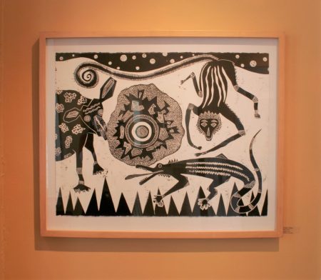
Saad Ghosn, “Sunday’s Visitors”
Fred Daniell has two very self-assured linocuts in the show. In “Domestic Scene,” a woman leans on her elbows at the edge of a swimming pool filled with inky black water. She is curious, but neither fully engaged nor disengaged. As she gazes on somewhat skeptically over the top of her sunglasses, another figure has dropped a wine glass which shatters on the poolside concrete, spilling its inky black contents. We cannot tell if the second figure is male or female; all we can see are a pair of naked legs. The legs are in bright sun, sending pitch black shadows out behind them; there is another shadow on the lower edge of the print, possibly from another person approaching, which may well figure in to the story the print both tells and obscures. I feel like I might be looking at the frontispiece to a collection of Cheever stories. I was struck by Daniell’s interest in returning to the traditions of narrative, illustration, and cartooning (perhaps suggesting another distant connection to the artists of C.A.G.E.). But we are all living in a world of graphic narratives these days, and I thought that Daniell’s work suggested some of the new directions that printmaking might be headed in over the next decades of Tiger Lily’s important presence in the printmaking scene.
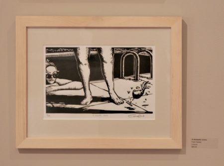
Fred Daniell, “Domestic Scene”