The Geometric Imperfection Of Design
By Danelle Cheney
Typefaces, or fonts, sometimes have more complex histories than we might guess. Times Roman–or Times New Roman, depending on which OS you use–has a long and unclear history. It seems that it was created for British newspaper The Times in the 1930s and 40s, but that story has been called into question by drawings dating from 1904 that could be the original inspiration for the typeface (a font consists of the physical letters used for printing, or now the digital files on our computers, while typeface refers to the design of the set of letters). Whoever drew it first, it’s since been redrawn and redrawn and redrawn, with small tweaks to both design and technology over the years, now existing in multiple versions sold by multiple foundries.
Other histories are fairly well-known, such as the hasty creation of Arial to supplant Helvetica (which was expensive to license) for use with IBM’s early printers. Helvetica itself exists in multiple formats; from its original release in 1957, it was reworked by various designers over the years to accommodate new and different methods of reproduction. The latest and most thorough revision, Neue Helvetica, was released in 1983. The documentary Helvetica, about the origins and ubiquitousness of the typeface, grabbed the interest of a wide audience if its ranking in iTunes’ bestselling documentaries is any indication.
Typeface designers represent a relatively small portion of the graphic design industry. They can spend years drawing a single typeface, perfecting each and every letter (both upper and lowercase), as well as numerals, symbols and variations to include multi-language support. One of their most important considerations is the application of a finished typeface. Some typefaces are commissioned and designed for very specific applications, and then go on to have fruitful uses elsewhere. Others are designed to be as flexible as possible from the beginning, much like Helvetica.
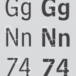
In the 1970s, AT&T commissioned Matthew Carter to design a typeface for their printed telephone directories. Carter’s task was to create a font that allowed better readability and decreased the amount of paper required to print all the listings. The result, Bell Centennial, was drawn with exaggerated cut-outs called ink traps that allow for the inevitable spread of ink on newsprint. It reads extremely well at small sizes in poor printing conditions, but when used at a larger size the cutouts are visible and can be distracting.
![[1] Bell Centennial by Matthew Carter, via Wikimedia Commons. The circles highlight ink traps designed to accommodate ink spread at small sizes.](http://aeqai.com/main/wp-content/uploads/2013/09/1-650x768.jpg)
[1] Bell Centennial by Matthew Carter, via Wikimedia Commons. The circles highlight ink traps designed to accommodate ink spread at small sizes.
In contrast to the tiny size of a telephone directory, some typeface designers contend with enormous sizing needed for large-scale signage and environmental graphics. When President Eisenhower announced his plans for a larger Interstate System in 1956, a set of typefaces was quickly created, based off die cuts that had been previously used for highway signage. This set of typefaces is known as the FHWA Series (also referred to as Highway Gothic) and consists of variations called A, B, C, D, E and F and was intended to serve as a unifying nationwide standard for signage.
The FHWA Series was never formally tested for readability on roadways, nor was it designed with a great amount of care and expertise. It is the sort of roll-up-your-sleeves-and-get-it-done project that is perhaps not perfect for the job but is nevertheless charming in its own right. Typeface designer Tobias Frere-Jones released a typeface inspired by the FWHA Series called Interstate, which has been popular, perhaps because of its vague familiarity with consumers. It’s used by Southwest Airlines and even the US Army for signage and marketing campaigns.
In the early 1990s, the Federal Highway Administration became concerned with a problem they call halation, which is the blurry effect many drivers see when headlights shine on the highly reflective interstate signs late at night. When traveling at 70 mph next to other vehicles, often in the dark or in bad weather, instant legibility is key for interstate signage. Around the same time, environmental designer Don Meeker was working on a signage system for Oregon’s scenic byways. He had been asked to come up with a system that allowed the state to include more information on signs without making them more cluttered or hard to read. After several rounds of testing, Meeker felt that the solution he was searching for would also solve the problem of halation. He proposed a joint study, and along with typeface designer James Montalbano, began the long process of drawing the typeface Clearview.
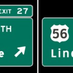
Clearview is roughly based off the FHWA Series, but with improvements for better readability at high speeds, long distances and in poor lighting conditions. The negative spaces inside the lowercase letters (called counters) are much larger than in Highway Gothic, seen here in the lowercase “a” and “e”. All the lowercase letters are larger in height and negative spaces more evenly balanced. Initial test results showed a large increase in readability when using Clearview, and since 2004 the typeface has started to appear on interstate signs across the country as individual states replace older signs.
While the casual observer may not immediately distinguish between the older Highway Gothic and newer Clearview, most will certainly distinguish that Clearview is easier to read, even if they can’t explain why. Tiny considerations in the construction of individual letters will change an audiences’ perception of the entire message. Some typefaces seem formal, while others feel clean and clinical. Still others can be authoritative and some seem trustworthy. They influence the way we perceive the intended message, even if only subconsciously.
Typefaces like Clearview–sleek, clear, and crisp–almost feel as though they were designed by machines, with strict mathematical precision. The opposite is in fact true; typeface design is more concerned with optics than geometrical precision. Geometric perfection does not equal optical perfection.
Letters ultimately appear in groups: words, sentences, and paragraphs. Our minds do not read words letter by letter; rather, they learn to recognize the shapes words make. The majority of a type designer’s time will be absorbed by analyzing and tweaking how letters work together in groups, in certain pairs and certain words. Every pair of letters possible in the Roman alphabet (325, not counting symbols or numerals) is individually considered by the designer to achieve an optimal relationship between the letters.
As Massimo Vignelli says in Helvetica, typefaces are much like music: the space between the letters is just as important as the letters themselves.
- [1] Bell Centennial by Matthew Carter, via Wikimedia Commons. The circles highlight ink traps designed to accommodate ink spread at small sizes.
- [2] Series B-F of the FHWA typefaces, via Wikimedia Commons.
- [3] A comparison of Highway Gothic (left) and Clearview (right).
Danelle Cheney is a graphic designer specializing in typography, publications and photography. Her hobbies include traveling, hiking, playing with cute puppies, and taking photos of beautiful old signs. She can be contacted at danellecheney [at] gmail.com.

![[2] Series B-F of the FHWA typefaces, via Wikimedia Commons.](http://aeqai.com/main/wp-content/uploads/2013/09/21-650x312.jpg)
![[3] A comparison of Highway Gothic (left) and Clearview (right).](http://aeqai.com/main/wp-content/uploads/2013/09/3.jpg)


