“Aquachrome: Contemporary Watercolor,” Manifest Gallery
By Karen Chambers
I have always found watercolor to be a technically daunting medium, something I never wanted to try in undergrad as I worked toward a B. F. A. (Me? B. F. A.? My adviser said I needed to understand the problems visual artists faced as I pursued art history; I do).
How do you control a medium that is so unforgiving? Once a mark is made, a color laid down, you can’t revise or reverse. Mud is the inevitable result. The only thing for it is another sheet of paper.
Looking at Manifest Gallery’s “Aquachrome” exhibition (the title borders on being too cute by half), I was reminded of a glassblower who said, “You don’t control glass; you just try to keep up with it.” It’s a sentiment echoed in the gallery statement for the show: “the artist practicing watercolor works with a tiger in the room.”
Further the statement quotes David Hockney: “With watercolor you can’t cover up the marks. There’s the story of the construction of the picture, and then the picture might tell another story.” And there is John Singer Sargent’s comment on the spontaneity of the medium: “Make the best of an emergency.”
The statement also says the medium is centuries old—perhaps dating back to the cave paintings of Paleolithic Europe–and has been used for “concept development preliminary to ‘finished’ paintings made in oil or other scale-worthy durable media . . . The nature of the media (sic) itself represents a delicate and dictatorial transparency, fluidity, and a potential for expressive spontaneity,” making “it an ideal vehicle for contemporary art . . . ” I’m not convinced about that.
But in general, the statement makes an excellent and concise introduction to the juried exhibition, which presents 17 works by 14 artists from the U. S. and abroad (India and Belgium). In a blind (think about that) jury process, 335 pieces by 139 artists were considered, so I assume the exhibition is a credible assessment of the state of watercolor today.
In the show, I discerned several veins of exploration. First is what I’ll call “traditional” watercolors, meaning mostly representational work delighting in the fluidity and transparency of the medium. The second is abstract or nonobjective, represented here by several watercolorists too obviously inspired by contemporary artists with quite recognizable signature styles. Then there are watercolor illustrations that hark back to the work of “botanists, illustrators, and portraits,” who, per the gallery statement, found watercolor an agreeable medium. There are the golly-gee technical tours-de-force, but also works where the medium is incidental to the impact of the image.
Let’s get the first “category” out of the way first–pieces that fit my conception of watercolor: impressionistic limning of a representational scene. From Hyderabad, India, Dhiman Dam offers She from this year. The artist has painted a woman with an enviable body lying on her stomach. With her head turned to the viewer, she rests on her arms bent at her elbows with her legs bent upward at the knee. Watercolor’s transparency lends a dreamy air to this piece. Pleasant enough but hardly arresting.
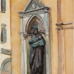
Also in this category is Bloomington, Indiana’s, Tim Kennedy’s Saint Mark/Orsanmichele, 2009. It’s a rather awkward rendering of Donatello’s 1411 statue of St. Mark found in an exterior architectural niche on Orsanmichele, a church in Florence. This sketch might have come from an artist’s notebook, or perhaps was done by a traveler doing the Grand Tour of Europe, considered de rigueur for privileged young Englishmen in the 17th and 18th centuries as a part of their education.
Next the works of three artists appear inspired by/derivative of the contemporary masters Mark Rothko, Willem de Kooning, and Helen Frankenthaler.
From Behind the Stars, 2013, by Diane Szczepaniak looks like an off-kilter Rothko or a blurry Albers’ square that’s drifted diagonally to the upper right corner. On a luminous field of hibiscus pink, the Potomac, Maryland, artist’s near square rectangle is an amazingly radiant beige and is surrounded on the left and bottom sides by a halo of darkened blush pink. There is a one-inch border of a slightly deeper pink around the composition with a small area in the lower left untouched. However, a blotch of that pink has bled outside the border here. As beautiful as Beyond the Stars is, there was too much Rothko for me to embrace it fully.
De Kooning is quoted in the gallery statement: “Watercolors (sic) is the first and last thing an artist does.” Alexandra Dooley from Cedar Falls, Iowa, pays homage to that Abstract Expressionist in her 2012 Rainbow Bright. I was reminded of de Kooning’s Women because of her loose handling of the medium and the two figures, one reclining with an uplifted head and mouth slightly open in anticipation of a kiss by another who bends over her that are almost lost in the background. The energetic brushstrokes are pure de Kooning, but Dam’s palette is far prettier than his. A credible effort but ultimately too “school of.”
All I can say for Richard Diedrich’s Solar Flare, 2013, is Helen Frankenthaler. The Atlanta, Georgia, artist even shares the medium is “poured watercolor.”
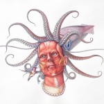
Roberto Osti has allied himself with the botanists, and by extension, zoologists, who favored watercolor. He’s contributed two detailed, almost hyper-realistic pieces–Deconstructing a Werewolf, 2008, and Medusa, 2012—to the exhibition. The forthrightness of these fantastical creatures recall the 16th-century Mannerist Giuseppe Arcimboldo’s fanciful portraits composed of fruits, vegetables, flowers, fish, books, etc.
In Deconstructing a Werewolf, the head is flayed, revealing the head’s musculature and the jawbone with human molars but also dangerous fangs. All of the innards of the beast’s neck are exposed: muscles, windpipe, spine, veins, and arteries. His eyeballs have literally popped out of his head and menacing needle-nose pliers, which look like the beak of a malevolent bird, pull at his still human ear.
In Medusa instead of snakes growing from the head of one of the mythical Greek Gorgon sisters, the Flemington, New Jersey, artist has placed an octopus’s body like a cap on her flayed skull. 12—not the normal eight–tentacles reach out and curl at the ends like a fiddlehead fern fronds. The pearls of her choker echo their suction cups. This time Osti has left the eyes in their sockets, brown and beseeching. A humming bird, whose beak is not that different from the werewolf’s needle-nose pliers, pecks at her check.
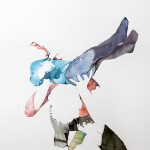
Fitting into the virtuoso group is the 2008 The Good Life 1 by Wouter van de Koot from Antwerp, Belgium. He masterfully exploits watercolor’s qualities and shows how negative space can be as important as painted areas.
Seen from above is shaggy-haired figure, which I’ll venture to say is male and go further to identify him as a father. He has lifted an oddly impassive toddler over his head. Van de Koot has depicted the adult’s head, sections of his arms, and most of the child’s face as if in silhouette by leaving those areas unpainted. Still their heads and limbs are recognizable although there is nothing to set them apart from the untouched background.
Garry Mealor from Anchorage, Alaska, gives us a technically impressive and intriguing topographical view of four carefully rendered tomatoes. They are all deliciously ripe, but show no hint of rotting. This is not a memento mori. Instead these tomatoes seem to be taking part in a narrative.
The fruits are lined up vertically in the center of the composition and cast shadows from an angled light source. Its title–Fall, Sink, Pinch & Rest–perfectly describes the 2008 picture. At the top, a tomato might be falling or has fallen; the next sits in a sink drain surrounded by concentric circles of red and purple, suggesting it may be being sucked into the drain; the third tomato is pinched between those swirls and the rock where the last tomato rests. It’s a completely staged still life seen from an unexpected perspective, and that makes this work far more intriguing than his virtuoso performance.
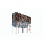
And Nathan Heuer’s Rustbelt National Monument from 2010 is technically accomplished, but that’s not the first thing I noticed. Here the medium is subordinate to the composition and what it evokes.
Smack in the middle of the pristine sheet of paper are five derelict rectangular metal container structures. They are lined up side-by-side and are supported by tall legs. The overall shape is that of a boxcar. A free-swinging ladder on the far right offers access. The structure’s exact purpose is unclear. It might have been for storing grain as four of the five have hoppers that could funnel their contents into trucks.
The rust on the metal structures is carefully painted and conveys a sort of beauty while also telling the story of industrial decline.
The image recalls Bernd and Hillel Bechers’ photographs that elevate homely industrial buildings and structures into, well, monuments.
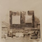
The Indiana, Pennsylvania, artist has focused on an abandoned structure, and Carrie Callihan from Cincinnati expands that to a geographic area being destroyed. Her piece’s title, Leveling Appalachia 1, surely refers to the practice of mountaintop removal mining. She’s covered an inkjet transfer of a photo of a main street of a declining small town with washes of gray, technically a non-color, watercolor.
The scene is located in time by the price of gasoline on a filling station sign: $2.79 and $2.89. Levitating over the town is a gray block, with this caution: “Warning charged holes will be marked with reflective cones, barricade tapes or explosive signs.”
I know I shouldn’t be disappointed that watercolor plays a rather minor role here. It is a very effective way to cast a funereal pall over the dying town, and since the image is strong, it wouldn’t have bothered me in the least if this show weren’t focused on watercolor, but it is.
This raises the question of the value of having an exhibition devoted to a specific medium. “Aquachrome’s” companion show “Fresh Paint,” which is being reviewed by Kevin Kelly for this issue, is even more problematic. The organizing principle here is that the work must be painted, which is loosely interpreted to include a relief of cosmetic sponges by Margery Amdur called Accumulation 1, 2013.
“Fresh Paint” could also have included watercolor, but those entries were “steered in that (the “Aquachrome”) direction when they (were) submitted,” according to Jason Franz, executive director.
Even though a blind jury of seven reviewed 940 works by 369 artists and selected 32 from the U. S. plus Canada, China, and Germany for “Fresh Paint,” I’m not sure what the exhibition says beyond painting is alive, a condition once widely debated.
Just an aside, why is it that to me the strongest work in Manifest’s exhibitions tends to be representational? I have no way of knowing if the entries to Manifest’s calls are themselves skewed toward representational work, or if the jurors feel compelled to include a certain amount of abstract work whether it stacks up favorably against the more realistic work or not. I’m sure Franz would argue against this charge.
But I’ve had this feeling about—I won’t be absolutist—many of the exhibitions I’ve seen there. I just wish I could figure it out so it wouldn’t intrude on my assessment of the shows.
Karen S. Chambers
“Aquachrome: Contemporary Watercolor” through Dec. 6, 2013, Tues.-Fri. 2:00-7:00 p. m., Sat. noon-5 p. m. Manifest Creative Research Gallery and Drawing Center, 2727 Woodburn Ave., Cincinnati, OH 45206, 513-861-3638, www.manifestgallery.com.
Photos:
• Dhiman Dam, She, 2013, watercolor, 8” x 12”
• Tim Kennedy, Saint Mark/Orsanmichele, 2009, watercolor, 10” x 8”
• Diane Szczepaniak, From Behind the Stars, 2013, watercolor, 42” x 45”
• Alexandra Dooley, Rainbow Bright, 2012, watercolor, 50” x 38”
• Richard Diedrich, Solar Flare, 2013, poured watercolor, 40” x40”
• Roberto Osti, Deconstruction of a Werewolf, 2008, watercolor, 18” x 16”
• Roberto Osti, Medusa, 2012, watercolor, 23” x 40”
• Garry Mealor, Fall, Sink, Pinch, & Rest, 2008, transparent watercolor, 26” x 18”
• Wouter van de Koot, The Good Life 1, 2012, watercolor on paper, 29.9” x 22”
• Nathan Heuer, Rustbelt National Monument, 2010, watercolor and graphite on paper, 30” x 44”
• Carrie Callihan, Leveling Appalachia 1, 2013, inkjet transfer and watercolor on paper, 13.5” x 12”








December 2nd, 2013at 12:22 am(#)
Ms. Chambers suggests that my piece is one of Aquachrome that is a rehash of recognized abstract painters, in my case, Helen Frankenthaler. Frankenthaler, whose work I admire but don’t emulate, stained raw canvas with blocks of color. Leading to a very different result, my poured watercolor is on primed canvas so the paint of each glaze sits on the surface. Succeeding pours may pick up earlier pigment, blend and create sedimentation. Because the paint is transparent watercolor on white canvas, there is inherent luminosity. The fluidity and transparency cause subsequent pours to create gradation, granulation, and furling at the edges. Little of this was expressed in Frankenthaler’s work but it is the essence of my process. As part of a show on creative use of watercolor, perhaps the piece at Manifest deserves a closer look.
If Ms. Chambers elects to judge an unusual application in this classic medium by just tossing it off as a retread of a recognized painter, let’s get the selected artist metaphor at least close, in this case, how about Morris Louis? Morris learned to pour paint from Frankenthaler but with very different results. Even Morris, however, didn’t pull it off in watercolor.