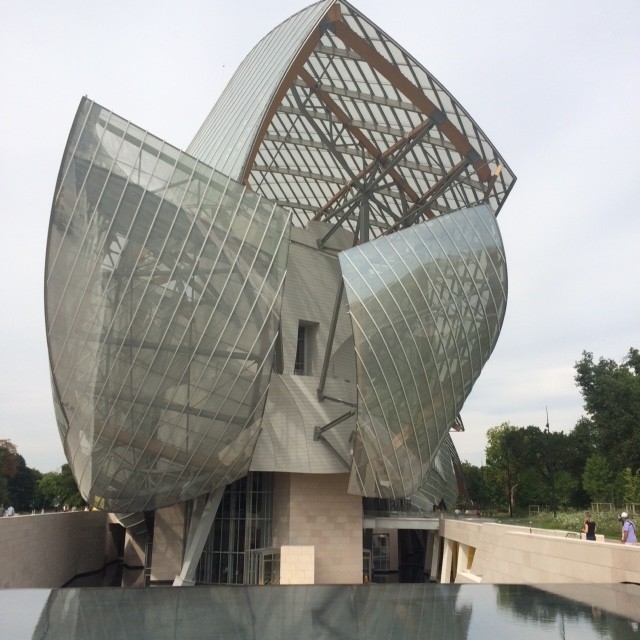
The Bois de Boulogne is a large Park on the outskirts of central Paris. It is a serene, green space with ponds and paths and playgrounds and now, an astounding Frank Gehry designed private museum. It was commissioned by Bernard Arnault, Chairman of LVMH, the luxury goods conglomerate and owner of Louis Vuitton to, in part, house his and LVMH’s contemporary art collection. A nearly $150 million dollar structure of curved glass panes affixed to metal panels with wooden beams and metal struts, it is a multi-layered, jig-saw-geometric-parabolic-protrusive mash-up. Impressive and gravity defying from the outside, it is even more impressive on the inside.
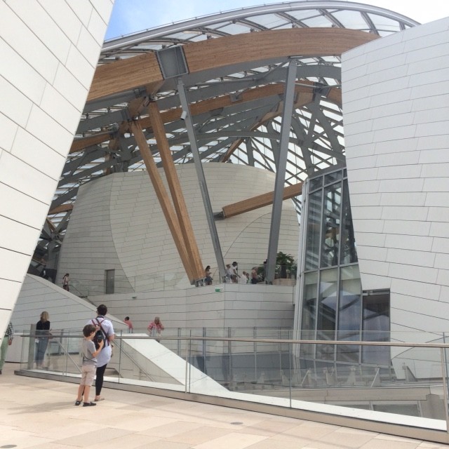
Gehry, who designed the Vontz Center for Molecular Studies at the University of Cincinnati, has succeeded in creating great museum spaces within this curvilinear craziness. Some contemporary architects of this era have struggled to create both a memorable exterior and a functioning, art-friendly interior…not Gehry, at least in the case of Foundation Louis Vuitton. Floors seem to be divided into large, well lit galleries, often with some natural light and perfect for monumental works of art. Around the corner, adjacent smaller galleries buzz with video art installations. I say “seem”, because each floor is different in its footprint, always changing and surprising, and always a different view to the outside. But, despite all the angles, the galleries don’t lead you into dead-end corners or diminished space.
As you climb higher the building opens into more and more light, large terraces that wind and move you up the outside of the structure, affording views of the park and the city beyond. But, always the building…its presence is in every view. The building is like jazz: complex, multi directional, sometimes off-kilter, not easy to comprehend, but, ultimately melodic and pleasing.
Almost secondary to the building is the collection. Andy Warhol’s portfolio, Ten Portraits of Jews of the Twentieth Century anchors one long wall of a spacious gallery. A monumental Gilbert and George triptych extends along another wall. It is a huge gallery with just 3 or 4 works of art, but the works need the space and they look good in it.
Christian Marclay’s “Crossfire” from 2007 is another example of his mastery of video art and the use of small clips from a variety of motion pictures. Four screens, a screen per wall, beam clips from violent, iconic movies. Starting with bullets being loaded into clips in a slow rhythmic sequence, gun after gun is loaded, the clicking building in momentum. Then the barrels roll and one by one, the guns are fired singly then rapidly increasing like some tribal drumming, the violence of it all just exploding off the screens and you’re surrounded by it, awed by it. Only the shooters are shown, never the victims, which adds a bloodless menace to the rhythmic staccato.
There is other art, of course. Thomas Schutte, “Mann in Matsch” from 2009 is a large polystyrene sculpture of a man (Mann?) that commands pretty much an entire gallery. The art is never overcrowded. Space abounds.
How to put Foundation Louis Vuitton in context with the other Paris museums? It is enough that it is a new and iconic institution that adds to Paris’ cultural arsenal. I’d put it near the top of the many must-sees when visiting Paris, but, more for the building itself than the contents. The art doesn’t disappoint, it is just a tall order for it to rise to the quality of the other Parisian museums.
–Kevin Ott


