Keith Haring 1978-1982, the exhibition at the Contemporary Arts Center representing the formative period of the artist, reveals the diversity of his early artistic engagements. It confronts the visitor with his sketches of penises, affirming the youthful Haring’s newly liberated sexuality; narcissistic video work, alluding to a preoccupation with selfhood; and his curatorial roles, divulging his passionate involvement with the New York City art community. They all belie the affirmations and investigations of a young man’s intensely social psyche despite the private nature of some of their content. The experimental side of his work is evident as well, from typeface word-play to messy collages.
The early Haring was transgressive. In addition, the exhibition includes an enjoyable slideshow of his participation in graffiti in the form of his impromptu white-chalk drawings in the black space of empty subway advertisements. Street art was both his ambition to be discovered as an artist and an expression of his public exhibitionism; it worked. His innocent “boy next door” proved to be a palatable figure from the New York City street artists, with subsequent international success until his early death.
Perhaps the commercially successful, playful Keith Haring that the mainstream population associates with the artist haunted the curators of the show, who may have wished to reveal him as the experimental, edgy, ‘meanings-based’ contemporary artist. Nevertheless, that image of Haring—the globalized, mainstream one—may well be the reason many attend the exhibition. I do not feel qualified to evaluate the curatorial choices, since I am only lightly familiar with his life work. The work on display is his early work; we remain, appropriately, to make our own judgments. In such a context, I was drawn personally to the evolution of what I found to be his decentered creative technique. Also, I found myself reflecting upon the broader cultural reasons why the public responded to his popular style.
The Decentered Impromptu Composition
Circle Play (1979), Haring’s early experiment with video, blends documentation, poetry, and painting. In the video, one may observe Haring in action, painting a room-sized white sheet of paper resting directly on the floor. In the middle of the room, another male figure sits on a stool, reading aloud from a book. Haring fills out the entire “canvas” with his thick black lines and stylized shapes, culminating in a delineated circle around the base of the stool.
As I watched Haring at work, it became evident to me that he is wholly concentrated only upon his composition’s immediacy (the lines and smaller shapes before him) while ignoring the greater composition. His eyes follow his brush carefully, leaving his black swathes smooth and consistent. What becomes “loose” is the whole; it is created without any premeditation or planning.
This is the reverse technique of how many artists may work. I imagine, perhaps wrongly, that abstract expressionists (or action painters) such as Pollock or de Kooning were mostly ‘playing’ with the overall developments of their compositions in such a way as to free their mark making; I imagine them occasionally stepping backwards in the midst of their work in order to assess the wholeness of the composition. (Haring made some forays at mimicking the abstract expressionist style, but abandoned the approach.) One notes, for example, the overt harmony of Pollock’s later compositions; the artist heavily balanced his impromptu drip marks. He did not work from the outward to a center, but from a center to the outer edges of the canvas. The mark making becomes something on the confines of consciousness of an artist like Pollock and is hence liberated from a possibly overly meticulous mind, i.e. the looseness of the paint arises because the consciousness of the artist is focused elsewhere: the overall composition, not the immediate brushstroke.
Haring is able to achieve a decentered approach to composition due to his extensive study of form. In his notebook writings and 25 untitled drawings (Variations) (1978), one may witness the breakdown of his compositions into his language of “letters” or “words.” The parts resemble jigsaw puzzles, but are not designed to fit perfectly together; their form is created so as to leave negative space as they come into contact with each other. In sections of his notebooks, Haring reveals the thoughtfulness of this study:
the eye tends to be drawn to “individual” shapes instead of the structure created by a (sic) entire “group” of shapes…planes can be interchanged to create different qualities—chance as opposed to calculated results. Works evolve out of a process. No measuring tools or straight edges used. No pre-determined ends.
The consequences of this careful formalist development of his painting vocabulary is evident in A Circle Play. Haring’s specific vocabulary allows him to paint shape after shape in his immediate physical location on the paper, each one relating only to the ones around it. The wholeness of the aggregate can be ignored by him while painting, since his study of form allows the wholeness to be engaging while he is concentrated only on the specific parts.
The Contemporary Arts Center also has on exhibit another large example of the early results of this technique, Untitled (1979, ink on acrylic paper; please note that I do not refer to the press image above). In Untitled (1979), the Haring abstract shapes fill the whole page. There is no sense of a whole composition that greets the viewer, but instead one’s eye becomes absorbed in the parts. However, Untitled (1979) failed to hold my attention. There is a peculiar lack of engaging content; it was energetic yet somehow lacking. I suspect that Haring must have sensed this, given the changes that occurred in his subsequent compositions. He realized that he needed to insert forms within his shapes that are readily recognizable by the public in order to invite meaningful (or easier) readings. This may partially explain the incorporation and use of the various figurative motifs so beloved by fans of Haring: the human figure with comic-book style “move” lines, the crawling baby, and the dog. Since his figurative motifs would be created in a manner similar to his shapes (spontaneously and without planning), they needed a form that would function even without a predetermined relationship between them. Their relationships would need to be ambiguous, like his abstractions. It is essential to witness in his use of these figures that Haring still created them according to his predeveloped technique: impromptu, zone specific, with little-to-no-reflection on the overall composition.
His subway drawings epitomize the fusion of the figurative and impromptu composition, created on the large black panels that existed in the absence of subway advertisements. (I encourage watching the documentary The Universe of Keith Haring to observe just how effortlessly he works in this fashion). He would respond to the images about him and loosely let his composition unfold. This mediation on the surroundings, I believe, is key to the appeal of Haring’s figurative and public work. For if his approach was to liberate his compositions from a heavy-handed intentionality (imitatio naturae), he required some source of inspiration to direct his activities. The subway ads invite this as he could respond to them, albeit loosely. The watchful voyeurism of the people waiting for a subway train would give him further inspiration. Painting on walls and other visible public spaces allow for exhibitionists a kind of “input” from the presence (and watchful eye) of bystanders as well as the actual physical building structures.
The Industrial Line
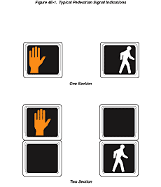
The thick Haring line-style, so often referenced by commentators in relationship to comic books and minimalist pop art, also just as easily recalls lines as diverse as industrial print typeface (which he manipulated and posted in public spaces), crime scene corpse tracings, and legal signage. Of the last, if we imagine, for example, the white figure that lights up at intersections to indicate that it is safe to cross, we associate the image with both trust and authority. It is part of a public aesthetic of imperatives, designed for mass production, ease of understanding, and rapid visual identification.
Such figures also serve to shape public behavior, and even private behavior. From crosswalk signals to gender bathroom signs, we are often confronted by the hard-lined, figurative signage. I believe that there is an unconscious association with Haring’s figures and this kind of authoritarian signage. If we consider also that Haring’s work is (or was) especially exciting when it entered (either legally or illegally) the public space (such as large murals or subway art), we can see how it subverts our experience of the aesthetic of authority. For example, instead of a crosswalk signal, we have a figure dancing. His white-on-black monochrome approach further illustrates this aspect of our experience of his art. His work was hence in part—artistically speaking—a transformation of the formal qualities of signage, breaking up the normative experience of public space.
Haring’s studio was best when it was the world. If there were any broad-based statement I could make about Haring’s compositions, it is that they are about human relationships within the compositions and to the composition itself to content outside of its frame. (Sometimes, he would begin a canvas by drawing a rough line around his compositions, as if to narrow his perspective into a workable scale.)
It is difficult for me to evaluate his legacy in terms of the consequences of his art on our experience of the urban landscape. We may playfully imagine the difference between careful city planning and the spontaneous art of Haring. City planning ostensibly results from deliberations as to how signage is to be placed, human activity is to be directed, and (hence) public space is to be organized. Corporate advertisements are similarly apportioned according to a market economy, and with a careful study of their power to manipulate consumer desire into needs. (The design of the shopping mall was its pinnacle.) In this context, imagine the sudden appearances of Haring murals, composed in their very making. Such murals also appeared quickly, surprising the public with their sudden arrival. Or, next to an advertisement on the subway, a white-chalk composition mysteriously arose that seemed both innocent, ambiguous, and playful. Yet, it questioned the aesthetic of the ad and the designated authority of its location. The Order was undermined; the effect was strangely enjoyable.
– A.C. Frabetti


