
Betwixt & Between
Painting by Jean Mehdi Grangeon of Broken Daisy Studio & glass work by Darryl Berry
at Marta Hewett Gallery
By Larry Watson
When I entered the Marta Hewett Gallery to see this exhibition of glass by Darryl Berry and paintings by Jean Mehdi Grangeon, the two exhibitions seem to work seamlessly together, as if both were part of one installation, a tribute to Hewett. After some adjustment time, I pulled up a chair and sat awhile, and the layers of meaning and visual dialogue began to unfold.

Daryl Berry
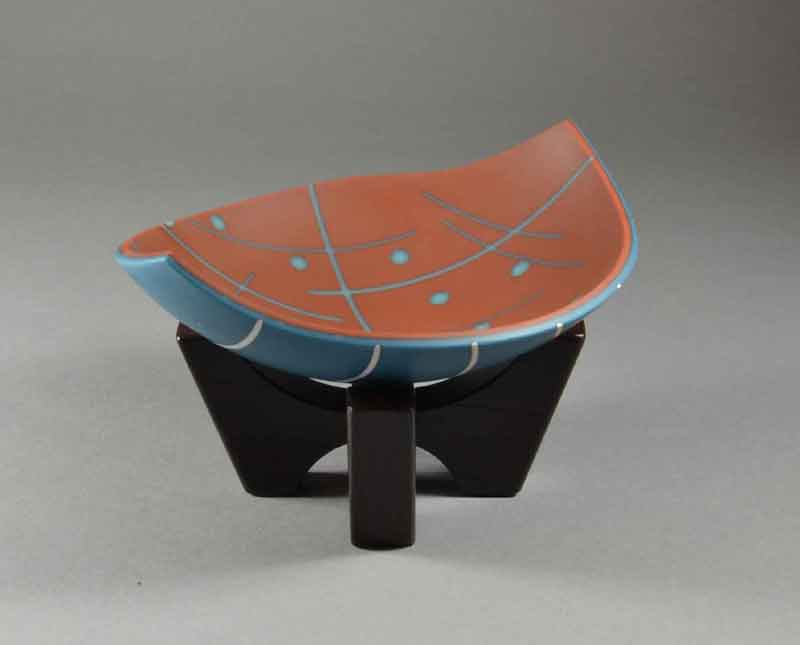
The glass pieces are immediately noted for their complexity and harmony of designs from top to bottom, which in situ are difficult to completely engage in without picking them up and discovering the dichotomies and contrasts, similarities and shadows of images revealed from one surface to the other.
And then there is the third surface. Though reflecting the traditional 2 dimensional format of kiln-fired glass, Daryl is able to infuse third dimensions both literally and suggestively. The forms are minimally vessel-oriented, and elongated with pointed ovals, graceful in outline and internal arch.

Darryl Berry Vessel XII
Looking at the edge of the glass, one can see that there are additional colors, shapes, and patterns sandwiched between the two outer layers. With the seeming intention of an underlying beat and tonality of musical accompaniment, the sandwiched elements would lead one to listen/look intently and deeply into the surface to discern these subtle elements attempting to glow through the translucence of the glass and its singular surface treatment.
The occasional use of clear glass, sans glassy-gloss surface, disappears and leaves the illusion of change in depth both on the surface and within the third inner layer. Begging a tactile exploration with digits, the interaction of the three layers of color and pattern sometimes requires analysis and reassembly within the viewer’s eye/mind, forcing a loss of ego in the intake of imagery, stepping into the Now-ness of it.
With the intention of master brush strokes, the haloes produced by the contrasting chemical compositions within the glass segments become the only definition in some pieces, while creating further dimensional tension of color contrasts in the rest. Haloes begin to glow like astrological photographs of the sun’s surface, a hazy remnant of the fuming within glass during the red-hot firing process inside the kiln walls, hidden from prying, curious eyes and secluded in the inferno for its private chemical mating dance. As the glass cools, the fuming is frozen in time and molecular structure to interact once again with light waves. The juxtaposition of chemistry and color creates halo exclamation points and quotation marks of design.
As a student of process, the extensive and meticulous grinding procedure that is used to reveal these subtle gifts of the kiln are appreciated for their integrity and dedication to effect. Further attention to final surface texture for a matte surface creates an immediate depth of color and surprising intimacy with the glass material, blurring the traditional, cold, glossy-hard barrier of glass and air, extending a warm invitation to caress and connect.
Jean Mehdi Grangeon
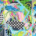
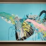
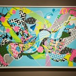
At first glance Jean’s work sparked the cynical side in me. Bright, fluorescent colors applied in nearly milleflori detail (from a distance) seemed to take on a color palette beyond Barbie dolls and anime on steroids. Then the irreverence of paint that was cut, obscured, and accidentally peeled re-engaged me with the immediacy and urgency of the artist’s hand and vision. Eventually, that irreverence in execution and palette seemed to reject commercial inference, taking on aesthetics unfettered by external reference.

Jean Mehdi Grangeon – “Le Baiser de l’orpheline” – Acrylic on wood panel
Using tape and knife that resulted in sharp-edged contrast, the process reminded me of the severe contrast of ceramic sgraffito techniques or linoleum prints. The tape was used as much for an emphasis on biomorphic shapes as it did on nearly-mathematically precise patterns. That “nearly” element of the slightest imprecision of execution, again, drew me back in with its vulnerable humanity.
This humanity was evident in the compulsive execution of layers and juxtaposition of these solid and patterned planes of color. The tapestry includes underlying, obscured patterns that have been abandoned along with their witness to the human attention, hours, examination, only to be sacrificed in the creative food chain to something better and necessary.
As the layers reveal themselves, the intention and intensity of this dance between discovery and creativity, between good and better, between now and finished seems to become clearer to the artist.
After time-laden familiarity (mine, that is), the palette of colors begin to complement each other, stark in the surrealism of neon intensity, almost shouting in adolescent glee, yet developing into a mature futurism and timeless assemblage. Is it still shouting? Yes, and it would not succeed without that decibel level, this very dissonance creating harmony, this sharpness further accentuating the dancing collision of geometries.
-

- Jean Mehdi Grangeon – “Harvest Moon” – Acrylic on wood panel

-
- Jean Mehdi Grangeon “La Lecture”


-
- Darryl Berry Vessel XII


-
- Darryl Berry Strata II


-

- Jean Mehdi Grangeon – “Les Mechanismes du Desir II” – Acrylic on steel and plexiglass

-
- Jean Mehdi Grangeon – “Mixed Feelings II” – Acrylic on wood panel

-
- Jean Mehdi Grangeon – “Le Baiser de l’orpheline” – Acrylic on wood panel

HYPERLINK “http://www.martahewett.com/exhibits/exhibit-fancybox.php?cid=betwixtbetween13”