
Geometrically Ordered Design:
Angels and Rainbows
By Dustin Pike
“Concerning matter, we have been all wrong. What we have called matter is energy, whose vibration has been so lowered as to be perceptible to the senses. There is no matter.” – Albert Einstein
This is my Twelfth article pertaining to the design field and its relationship with science and philosophy. In order to understand design language at its core, the viewer must understand the acoustics of perception on multiple levels simultaneously. This writing serves as my attempt to demonstrate how all art-forms, regardless of the source, are but the many reflections of one whole ‘Idea’ of nature. Through sharing the understanding and awareness of this concept, my mission is to help us to see in our jungles.
Finally I should say — take what you will, and dismiss what you will not. I am neither prophet nor scientist. Words and writing are powerful tools for those who can read between the lines and into the great depths.

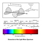
Light-wave Examples
What do we know of color? We should know that red is red, and blue is certainly blue, but these are merely names that we, as humans, have attributed to them. Their identity is indeed blatantly obvious and yet quite hidden from our view. What, in truth, can we say of yellow for instance? It is bright and commands our attention like no other color, yet even this very description is simply our sensual response to its appearance. Is it possible that a newborn, prior to having any outside influence, should perceive green or blue as the most ‘bright’ and ‘commanding’ color? In no way can any subjective desciption substitute for the hidden ‘essence’ of a thing, as they are our personal opinion and reflection. I propose that through metaphor we can discern the likeness of color, and achieve a glimpse into at least a smaller version of those great truths.

Additive & Subtractive Color
Firstly, one should know that the totality of all existence is light, and nothing else. This is no supra-metaphysical or abstract teaching. In fact this is ironically the one thing that today’s science and philosophy can both agree upon. Sound, color, material, and even thought are technically light-waves structured in various pattern-forms. This might seem like an abrupt and confrontational concept to some, but nonetheless it is found to stand. Nikola Tesla knew it, and so did Walter Russell and Edward Leedskalnin. These men, if re-born into society today, would still present knowledge that far surpasses most upon the subject, as each of them “knew the secrets of those who built the pyramids.” The color spectrum to them was but the many rungs of the one ladder of light; think Jacobs ladder.
In school we are taught that there are seven divisions within the realm of our sight, and these are red, orange, yellow, green, blue, indigo, and violet (See Light-wave Image). Again we are confronted by names at best, so we should pursue further. There is also what academia refers to as ‘additive’ and ‘subtractive’ color, which, in an abstract sense, are simply reflections of one another. Additive colors start with darkness and combine to form white, while subtractive color systems start with light, presumably white light. Filters such as ink or paint between the viewer and the light source, or reflective surface, subtract wavelengths from the light, giving it color (See Additive & Subtractive Color Image). In short both are simultaneously creating one another into an endless spiral; darkness creating light in order that it may be re-created in light’s own image.

Examples of the Chakra
Most esoteric philosophies claim that the model of man is a likeness to the entire created universe, so in this way we should also see the seven-fold division within ourselves, and so we do. This information has readily been passed down through countless generations as the ‘Chakra’ system, so-called in the eastern tongue which means, ‘wheels’ (See Chakra System Image). The division is identical with that of the visible light-spectrum, and is often given very specific attributable qualities according and relating to our psychic nature. We can begin to see color metaphorically as parts of ourselves and our surroundings:
Red -— within the human form it is located at the base of the spinal column at the Perineum. Its association is the physical basis of survival, and this is why it is often called the ‘root’ Chakra. For any idea to manifest it must initially have a ground from which to grow. In this manner it serves as human kinds physio-biological intelligence, since our safety and security come first. The square and cube are the most common shapes associated with this idea, and are thus used in tandem with banking systems and security forces. (See Security in a Square Image). It is to be noted that even within this single division there are another seven sub-divisions, and so forth, forever.
Orange — here, in the human realm, desire begins to stir. Sexual territoriality and emotional strength is the focal point, and is likewise located near the lower abdomen and genitals of our body. It is the ‘sacral’ aggregation of the Chakra system, which is derived from our Sacrum in our lower-spine. This color is formed by the interaction of both red and yellow, which along with blue are all traditionally held as primary. This makes orange, along with green and violet, secondary in respect to their primaries and are thus their ‘children’. When used in design language, orange has often been used to sway the physical appetite within us whether it be food, sex, or even relaxation.
Yellow — a normal set of eyes will tell you that this color is seemingly the most commanding of our attention. It is a primary color, which means that it serves as a parent to both orange and green. In the Chakra system it is referred to as the ‘solar’ point which is located at our Solar Plexus and, as the color may suggest, is responsible for self-control and empowerment. In terms of psychology, this is perhaps the highest height that our mental egos may take us. Designers often use this color to call upon our logical and masculine nature opposed to our emotional or feminine nature.
Green — this part of the spectrum is the very cross section of the entire system, and serves as the fulcrum point. Translated from Sanskrit, the ‘Anahata’, meaning unstruck or unbeaten, is associated with the Chakra of the heart. In terms of psychology, our ego, now realizing that it is but a small piece of sand in a very large sandbox, learns to accept things as they are and live in love and harmony with other egos. Balance here is the keyword, and in balance their is silence. Being the child of yellow and blue, green forms a bridge between the cool and warm color systems. From this point of view it seems quite obvious why the Jesus of the Christians, and Krishna of the Hindus taught the importance of this idea.
Blue — the bridge into the cool and dark colors has been crossed, and from here on there is ever more obscurity in relation with our physical symbology. Abstraction may only take you so far before it begins to utterly confuse. The Chakra center associated with this is located on the body near the throat, and is responsible for higher communication and expression. A deep understanding and respect for the arts is inherent, whether it be the work of a preacher, chemist, or painter. Blue has always been paired, in a symbolic sense, with water because of its reflective quality, which mimics the surrounding terrain. Designers would be wise in noticing that true art, in all forms, mirrors the environment exactly as it is perceived.
Indigo — this color is a reflection of the ‘third-eye’ of the Chakra system located between our eyebrows. Intuition and perception are meant in their purest form. As simple as these ideas may sound, when seen from a singular angle they are very peculiar. It is the part of us that ‘knows’. Designers will often use deep cool colors such as this to stimulate the feeling of dreaminess, sleep, and to give the impression of expansion. Complete inertia is the key here, and sheer silence. Resting between blue and violet, there is a sense that the spectrum is coming to a close. There’s no need to delve too far into this idea, since it far surpasses relative identity in the comparative sense.
Violet — upon the apex of the system, we meet a secondary color born from red and blue. The whole cycle is upon the brink of repetition. The Chakra system identifies this color with the 1000 petaled lotus sitting atop the head, and so it is called the ‘crown’. It is said, in esoteric terminology, that the seventh encompasses all like an umbrella and assumes the ‘infinite’ aspect of us all. Throwing description on such an idea is useless, since any idea may be valid in this case.

Security found in a Square
As stated before, the color spectrum is but our eyes’ interpretation of a much larger single idea. The levels express themselves differently for each of our sensual systems such as smell, taste, sound etc. For instance, the so-called Solfeggio frequencies which have been passed down through Gregorian chant, have been said to correlate with certain colors or levels of vibration within our audible range (See Solfeggio Frequency Image). Devout monks would sing aloud these very specific tones, and they were believed to produce certain psycho-spiritual effects. They were literally sculpting and adjusting their own vibratory frequency by simply producing and hearing sounds.

The Solfeggio Frequencies
I hope that by dissecting light and color in this manner, readers may look at themselves, and their art, with an open mind and heart. Beyond our senses lies a truth that may forever remain hidden, but that doesn’t mean we can’t search.
-
- Light-wave Examples
-

- Additive & Subtractive Color
-

- Examples of the Chakra
-

- Security found in a Square
-

- The Solfeggio Frequencies


June 6th, 2013at 3:40 pm(#)
I’ve enjoyed all that you have written but this issue is my favorite. The whole and complete color spectrum as it’s relationship to healing and Chakra is based on the collective human race as a whole. Many tribal studies I have done places different meanings on different colors based on their teachings and spiritual beliefs and not necessarily on reality as based on the collective. Great articles so please keep up the good work.