Revolutionary Typography
By Danelle Cheney
Graphic Design, like any creative discipline, does not proceed neatly through time from one school of thought to the next. Art history buffs know artists and their work can be categorized differently depending on where one draws the fine line of definition. Art history students might be less frustrated if they are taught to think of artistic movements as an enormous venn diagram rather than a neat timeline.
This is especially true in the period during and after the first World War, a time of unrest and uncertainty, but still hope, as society struggled to define what the future held. In the years leading up to the beginning of war, Futurism was taking hold, most notably with the publication of Manifeste du futurisme, or the Futurist Manifest, by F. T. Marinetti. The manifesto defines a love for technology, speed, the triumph of man over nature, and admiration of violence and youth. These ideals can still be seen in our contemporary culture, appearing in popular movies, video games and storytelling—youth, speed, and power as the key to the future. Marinetti went on to further discuss some specific tenets of Futurism in more manifestos published in the next few years.
In 1913, the Destruction of Syntax—Imagination without Strings—Words-in-Freedom was published. It says:
“I initiate a typographical revolution … aimed at the so-called […] harmony of the page […]. On the same page, therefore, we will use three or four colours of ink, or even twenty different typefaces if necessary. For example, italics for a series of similar or swift sensations, boldface for violent onomatopoeias, and so on. With this typographical revolution and this multicoloured variety in the letters I mean to redouble the expressive force of words.”
“The expressive force of words” was a rather new philosophy for many typographers of the era. Futurism, with its love for all things fast, shiny, and new, was also a sound rejection of the prim and orderly ways of the past. At the time, typography was a strict discipline. Typefaces were chosen for their functionality and pleasing forms, not their expressive power; meaning was expressed through language choices rather than visual considerations. Futurism sought to change that.

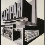
Padiglione Campari by FortunatoDepero, 1920.
Expressionism—which developed not as the result of a defined collective and manifestos, but rather because of the work of independent artists all across Europe—also used typography as an expression of meaning. We don’t see many examples of expressionism in commercial advertising, but dynamic examples exist in original publications and socio-critical pamphlets. Expressionist typography was a resistance to the conformity of culture, a deeply emotive form of social and political commentary. Letterforms are constructed in the same way as other elements found in work from this movement; harsh strokes arranged in disruptive cascades emphasize the bleak starkness of compositions.

Metropolis poster by Heinz Schulz-Neudamm,1926.
The Dada movement took inspiration from both Futurism and Expressionism (remember that venn diagram) with one large typographic difference: Dada was interested in the dissociation of form and content. The particular meaning of a word held no reverence for a Dada typographer, who would choose to emphasize the least meaningful elements, words, or phrases. A favorite Dada technique called paragonnage employed different typefaces and sizes within a single line or word. Techniques such as this underlined the Dada desire to create without purpose. No underlying order, structure, or theme can be discerned except that of chaos.

Poster Kleine Dadasoirée Haagsche K.K., by Theo van Doesburg,1922.
These Dada writers, painters, musicians, performers, and designers sought to reject the past and build a new future. Their desires coincided with frustrations in Russia over the Tsar’s handling of World War I. A series of riots in 1917 known as the Russian Revolution remove the Tsar from power and from then until 1922, Russia was embroiled in a civil war between Bolshevik and anti-Bolshevik supporters. It’s during this period of time Constructivism emerges, employing visual techniques from both Futurism and Dada (still thinking of that venn diagram) but with a very different agenda.
Constructivist designers in Russia called themselves “constructors” or “artist engineers,” and believed in the collective power of the people and a greater societal good. They did not view their work as political commentary, cultural criticism or personal expression. They believed their work was directly tied to the success and well-being of their fellow man. Constructivist typography is recognizable for its blocky, utilitarian forms arranged in dramatic but functional ways. It takes cues from Futurism—expressive arrangements of letters demonstrate speed, power, and youth.

Books!, photomontage by Alexander Rodchenko,1924.

Questions of Stenography magazine cover by Lyubov Popova,1922.
Interestingly, Soviet political leaders quickly decided constructivism was not quite to their taste, and the movement was banished in favor of realistic depictions of smiling, happy citizens. By that time, constructivism was on the path to influencing movements of its own, most notably the Dutch De Stijl and the German Bauhaus, namely through the work of El Lissitsky. Constructivism is still easily the visual style most highly associated with the Russian Revolution and USSR; its typographic styles, colors, and imagery are often appropriated by graphic designers today to reference the idea of revolution (look at Rodchenko’s design; now Google “You Could Have It So Much Better by Franz Ferdinand”).

Beat The Whites With The Red Wedge, by El Lissitzky, 1920.
, a collection of poems from Vladimir Mayakovsky, designed by El Lissitzky, 1923.")
Dlia Golossa (For the Voice), a collection of poems from Vladimir Mayakovsky, designed by El Lissitzky, 1923.
Contemporary designers draw a wealth of inspiration from all these movements: Constructivism, Dada, Futurism, and Expressionism. A design education today teaches students to think about both the form and function of typography; the visual connotation as well as the linguistic meaning of the word are considered. This relationship between form and function remains one of the most powerful ways a typographer communicates with his or her audience.
-
- Padiglione Campari by FortunatoDepero, 1920.
-

- Metropolis poster by Heinz Schulz-Neudamm,1926.
-

- Books!, photomontage by Alexander Rodchenko,1924.
-

- Questions of Stenography magazine cover by Lyubov Popova,1922.
-

- Beat The Whites With The Red Wedge, by El Lissitzky, 1920.
-

- Dlia Golossa (For the Voice), a collection of poems from Vladimir Mayakovsky, designed by El Lissitzky, 1923.


October 25th, 2013at 8:46 pm(#)
Hi Danelle,
Just stumbled across this, kudos! Loved your examples. Have you seen the doc Helvetica, quite good, graphics for World on a Wire are stunning as well.
Best,
Jeff
October 28th, 2013at 10:29 am(#)
Hi Jeff!
Thanks so much for your kind comment–it was quite fun to write and find all these great examples. I have seen Helvetica and loved it (of course) but not World on a Wire–I’ll be looking that up this week!
Thanks again, and I hope this week finds you well. Cheers!