Cincinnati should be proud that it has produced some of the most important artists of the latter half of the 20th century: Tom Wesselmann (1931-2004), Jim Dine (b. 1935), and Marcus Ratliff (b. 1935). It may seem like hyperbole to include Ratliff because he was a commercial artist, a term that seems quaint today. But he was as much a part of the rarified circle of groundbreaking artists who emerged in the early 1960s as his Cincinnati compatriots were. Ratliff was responsible for much of the material produced for galleries to promote them.
Ratliff’s association with these soon-to-be-blue-chip artists began in 1956 when he moved to New York to attend the tuition-free Cooper Union after a couple of lackluster years at the University of Cincinnati. DAAP didn’t exist, and the school did not have a studio art program, only offering courses in art education and practical design.
In 1959 Ratliff was living in the international and interracial Judson Student House on Washington Square in the West Village. It was run by Judson Memorial Church1, which in the 1950s was a hotbed of artistic activity in theater, dance, literature, and fine arts.2 In the Judson Gallery, which was started in 1957 in an unused space in the impressive late 19th-century church3, Ratliff gave Claes Oldenburg his first New York exhibition in 1959. He also showed fellow Cincinnatians Dine, the “bad boy”4 in his art classes at Walnut Hills High School, and the slightly older Wesselmann who he met in New York.
After graduating from Cooper Union in 1959, Ratliff attended Yale University School of Art for a year, but was drawn back to New York where the action was. Ratliff apprenticed with a former professor from Cooper in his letterpress shop learning to set type and to print. Galleries like Cordier & Ekstrom and the Contemporaries used the shop to produce letterpress invitations and posters, and Ratliff became the liaison with them
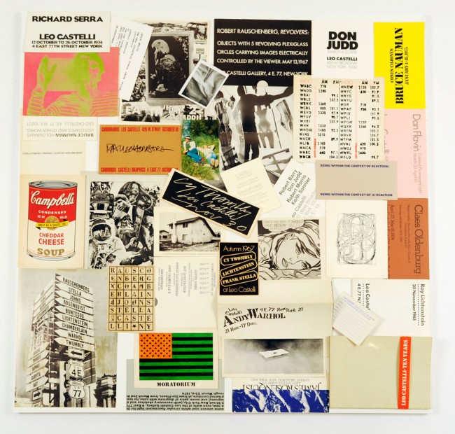
Even after landing a job with Time-Life in the book division and then with Fortune magazine, Ratliff’s social life revolved around the art world. When a friend who had been designing posters for Leo Castelli moved to California, she recommended Ratliff to take over; Castelli gave him a chance and he delivered. Ratliff then began to take on more and more free-lance assignments until his boss, who had been covering for him, finally gave him the choice of continuing at Fortune or striking out on his own.
Forced to make the decision, he consulted Castelli who asked him how many clients he would need to feel comfortable taking the leap. His answer was five. “Castelli reached in(to) his vest pocket and took out his little black address book and started calling people right then and there, friends like Pierre Matisse and Robert Elkon, Virginia Zabriskie, André Emmerich, and Richard Feigen, who he knew would give me work on his recommendation,” Ratliff recalls. “From that point on (1967), the phones did not stop ringing.”5
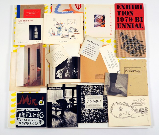
Ratliff’s clients eventually included Eleana Sonnebend (Castelli’s ex-wife), Virginia Dwan, Allan Stone, and Arne Glimcher’s Pace Gallery. As a graphic designer, Ratliff produced memorable posters, invitations, catalogs, and other ephemera as marketing materials for leading galleries. His exhibitions “Marcus Ratliff: Collages & The Art World: Forty Years of Graphic Design” at Carl Solway Gallery features a large selection of ephemera from Ratliff’s personal collection and shows the breadth of his commercial work.
His work always captured the essence of the artist it was serving; there never was a specific Ratliff “style.” For a 1969 Fred Sandback show at Dwan Gallery, the image used on the poster was the diagram for his site-specific string installation. Ratliff chose a crisp sans-serif typeface for the essential information. To not divert attention from the line drawing, the text is in a small font and printed in about as light a gray as possible to still be read. I can’t imagine a more apt design to communicate exactly what Sandback’s art was about.
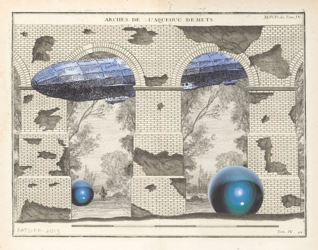
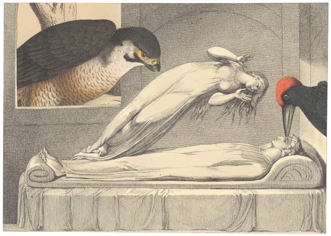
Until the introduction of the Mac in 1984, graphic design was a matter of cut and paste, just like the collage process. Before becoming a successful graphic designer, Ratliff had made some collages and returned to the medium after closing his design studio in 2007.
After years of subordinating his personality (I don’t think unhappily) in his graphic design work, he became free to reveal it in his fine-art collages, which are meticulously executed, witty, and very, very smart. “Marcus Ratliff: Collages” includes three done in the 1960s as well as more recent examples. Ratliff’s collages bookend his entire career of cutting and pasting.
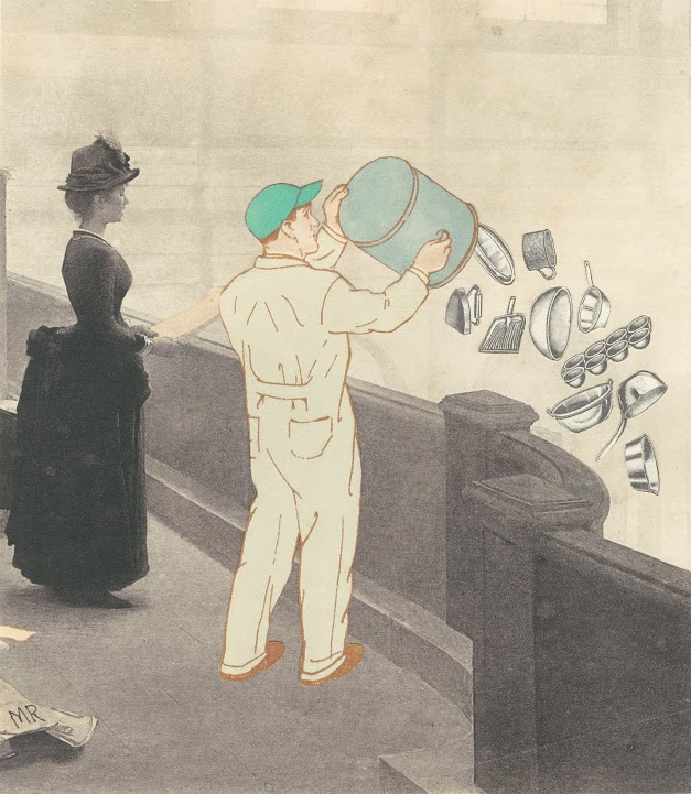
Ratliff says every piece starts with a story, and viewers are welcome to concoct their own. Incongruously in Duet, a corseted Victorian lady and a workman in overalls and a turquoise baseball cap share a balcony or maybe they’re standing on a bridge. He’s emptying a garbage pail of pots and pans and other household items while she stands erect holding a book at her waist. With her mouth open, she might be speaking or singing. It’s a Duet.
At a reception a woman approached Ratliff and proceeded to give him her feminist reading of the collage. She told him, “I know exactly what you’re saying here. It’s a very politically active suffragette rebelling against all those domestic things.”6 Ratliff replied that he was glad she had “such a strong interpretation, and I guess I have to agree with that one interpretation, but it’s not what I had in mind.”7 Instead Ratliff saw Duet as being about a lot of noise: the woman declaiming or warbling, and the garbage man making a percussive racket.
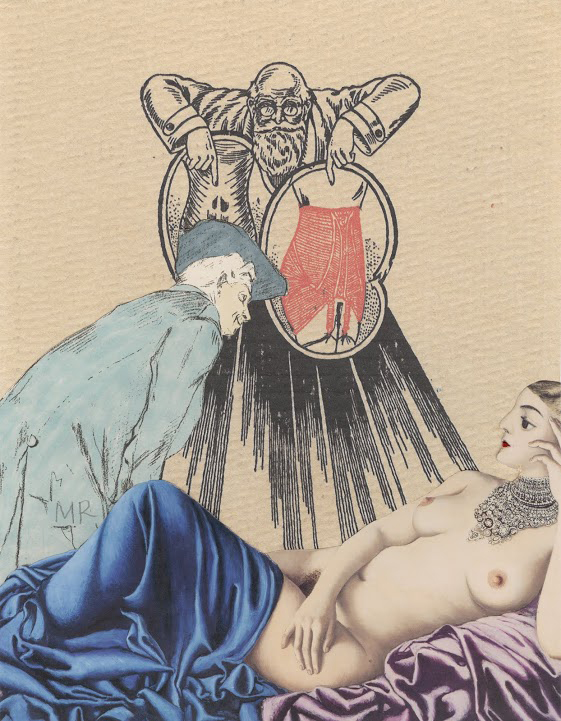
In The Visitation a voluptuous odalisque stretches out on a chaise longue, displaying all of her charms. She’s partially covered by Ingres-worthy blue and purple drapes. (I haven’t been able to locate the source of this image, but it obviously exists.) A gentleman, wearing a floppy artist’s beret leans toward her, inspecting her backside. Hovering over her like an angel in an Annunciation scene (there are even celestial rays emanating from him) is a bespectacled and bearded mad-scientist-type offers two girdles (definitely not Spanx shape wear), suggesting to the haughty nude that her body is in need of perfecting.
Ratliff could not have foreseen the recent flap over a Victoria’s Secret’s ad for lingerie with the tag line “The Perfect Body.” The models were standard issue for the underwear company with ample bosoms, flat stomachs, and a few prominent ribs. The ad launched a change.org petition, and coincidentally (?) the line was changed to “A Body for Every Body.”
I wonder if Victoria’s Secret will ever present more realistic body types à la the Dove Campaign for Real Beauty, which launched in 2004 and features real women. Victoria’s Secret might spurn Ratliff’s odalisque, but Dove would be happy to show her off.
Being a brilliant graphic designer doesn’t guarantee being an exceptional fine artist, but Ratliff is both. These exhibitions at Solway confirm that with the bonus of providing a history lesson about the art world during a particularly exciting period.
–Karen S. Chambers
“Marcus Ratliff: Collages & The Art World: Forty Years of Graphic Design” and “Marcus Ratliff: Collages,” Carl Solway Gallery, 424 Findlay St., Cincinnati, OH 45214; 513-621-0069, fax: 513-621-6310, info@solwaygallery.com, www.solwaygallery.com. Through December 20, 2014.
FOOTNOTES
1 This was part of Judson Memorial Church’s community outreach mission that began the moment of its founding as the Berea Baptist Church in 1875. (Today the church is affiliated with the American Baptist and United Church of Christ denominations.) The church’s location on the south side of Washington Square Park was selected because it marked the divide between the upper crust in Fifth Avenue mansions and immigrants in the tenements to the west of the Square.
Throughout its history, Judson has sponsored many programs aimed at serving the poor and the persecuted. In 1895 it built the Judson Hotel as affordable housing for the impoverished. A fountain on the northeast corner of the church provided cool water for those unable to buy ice. During the Great Depression, it allowed homeless men to sleep on its pews. In the 1960s, it opened the first drug-treatment clinic in Greenwich Village, and before Roe v. Wade, the church operated an abortion counseling and referral service. In the 1980s Judson was one of the few churches to acknowledge the AIDS crisis. More recently it has become involved with fair trade, gay rights, and the New Sanctuary Movement championing immigrant rights. www.Judson.org/Historical-Overview.
2 Starting in the 1950s, Judson gave up-and-coming dancers and choreographers like Trisha Brown, Lucinda Childs, and Yvonne Rainer a place to practice and perform. The Judson Poets’ Theater presented work by Sam Shepherd, Lanford Wilson, Joel Oppenheimer, and Obie-award winning musicals by Al Carmines, the associate pastor. Ratliff founded the literary quarterly Exodus with poetry, short stories, and essays with drawings by Oldenburg and Red Grooms. The Judson Gallery exhibited emerging artists including Robert Rauschenberg, Daniel Spoerri, and Yoko Ono as well as Dine and Wesselmann in addition to Oldenburg and Grooms. Ibid.
3 The church (1888-1893) and campanile (1895-1896) were designed by the McKim, Mead, and White firm with Sanford White taking the lead. Its style has been dubbed Lombardo-Romanesque, and the edifice combines Byzantine, Romanesque, and Renaissance elements. Seventeen stained-glass windows were designed by John La Farge, arguably Louis Comfort Tiffany’s chief rival. Augustus Saint-Gaudens designed a marble frieze for the baptistery, but it, along with the pews and crucifix original to the sanctuary, was removed in the 1960s. Paul Gallagher, intro., A Monograph of the Works of McKim, Mead, and White, 1879-1915.( New York: De Capo Press, 1985) on www.judson.org/OurBuilding site. The New York City Landmarks Preservation Commission designated the sanctuary, campanile, and attached Judson Hall as landmarks in 1966; they were added to the National Register of Historic Places eight years later.
4 W. David Powell, “Marcus Ratliff: Master of Cut and Paste,” Saranac Review 10 (2014). p. 97.
5 Ibid., pp. 99-100.
6 Ibid., p. 102.

