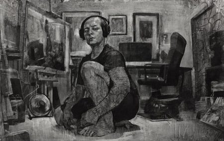
As you work your way through the drawings on view in the pleasant warren of rooms at Manifest Gallery, something wonderful happens when you reach Lucas Bianchi’s “Self Portrait in Studio” (2016). The energy of Bianchi’s drawing is everywhere in evidence, and it tells you this is a young man mad about drawing. We’ve interrupted the artist at his work—I’m not sure he’s happy to see us—and with his headphones on, he is in his own world. He shows us himself and piles of his work in various stages of completion, which he has drawn, drawn over, and then drawn on again. He depicts his own arms and legs as covered in tattoos, and then he has drawn white contour lines over the ink. He is practically as much drawn upon as drawing. Even his laptop sitting on the desk behind him looks like a blank surface ready to be drawn on. Over many of his finished works—even floating in the air itself, as if we were looking at a hallucinatory Miyazaki cartoon—are other line drawings of figures and costumes and props. Some seem to be slipping out from under the bottom of other works stacked along the walls. This is what it looks like to feel like you have a million ideas, though there may also be a hint that his million ideas have him, too.
There are probably more figurative works and portraits than any other genre here, and they do both familiar and unfamiliar things. Derek Wilkinson has a pair of clown-like self-portraits, one smiling, one frowning, in colors so vivid they seem psychedelic. Maybe the human face really does look like a psychedelic clown’s, if you give it a moment. There’s also a bit of Ivan Albright to it as well, an image of oneself straddling the border of grotesque, suggesting that this is a way the artist is coping with his premonitions of aging. Tanja Gant’s “1992” (2017) is a colored pencil portrait of a young man sitting in a straitjacket, looking at us in a way that would be hard to consider friendly. He seems irritated to be seen in this garb and makes one think about what it means to be posed and placed on display, whether it’s in restraints or in any other costume. What choices does the subject of any portrait really have? Richard Morris’s remarkable “Recumbent Figure” (2016) is designed to look and feel like a 19th century sepia photograph. The nude body is stretched out on its back, her shins catching the most light and the face almost entirely in shadow. The figure feels more like a medical specimen awaiting dissection than a person at rest. It’s hardly a psychological collaboration between artist and model; maybe it’s more like a trust fall. The picture is elegiac at the very least and haunting both in its openness to our gaze and its remarkable evocation of how another century looked at the human body–something that nominally hasn’t changed in a century and a half.
Among the best and most striking portraits at the Manifest were the pictures of animals, which were also images of resistance. Nicole Adkisson’s “Ya Amar” (2016)—my computer tells me the title means “my moon” or “my most beautiful” in Arabic—is a close-up of the eye of a pale-colored horse or donkey. The light-colored hair on the animal’s coat was rendered with loving detail. It is hard to tell what the eye is looking at; it might or might not be looking back at us while we are looking in at it. I thought there was something liberating about not having to assign a nameable emotion to a picture of a living thing, which was nonetheless psychologically present, in its own way. Even more remarkable was the monumentally sized “Simios Rostros” (2017) by Juan Perdiguero. (My computer tells me that the title means “Ape Faces,” and shows that Perdiguero has been working on a rather substantial series of them.) The work is a close-up rendering of an ape done by what looks like a combination of sensual dry brush work, scratchboard and probably a variety of other ways to make light marks against a dark background. The portrait takes on its depth because it does not anthropomorphize its subject. This ape is alien and independent, and seems to have its own thoughts which it is not interested in sharing, and has grandeur and mystery to it. The non-human eye, thoughtfully rendered, is a reminder about how little the eyes truly are windows to the soul. It called to mind how presumptuous some portraits can be in deciding for the subject just what sort of expression we are looking at.
The exhibit was culled from an entry field of almost 300 artists from 42 states and 16 foreign countries and winnowed down to the 35 artists (from 24 states and 2 foreign countrties) whose work you see at the gallery. The works were selected through a rather complex jury process, and sometimes that shows. Manifest is, I think, pleased that the show does not come to its audience with a strong argument about the most significant strands in contemporary drawing, but I’m not so sure. There are times when I thought the show would have been improved with a more deliberate curatorial effort, though I understand that such a show would be a very different thing than the one currently on view. I was surprised not to see more cartoons, for example, or more engagement with tattoo art, or more signs of the way computers are changing the way artists make marks, to name a few. There was fairly little of something as conventional as landscape drawings (though what there was looked excellent) and fairly few examples of drawings made in unconventional ways with unconventional materials. There were some works on the border between traditional drawing and something else, and a very few that were drawings only by a considerable stretching of the term. Their inclusion was by no means a bad thing; I found myself as often wishing for more of it, rather than less of it. But I left hungry for a drawing show with more of a point of view.
Larry Cressman’s “Field Study VII” (2017) is a lovely shadow box installation of tiny angular fragments of graphite-stained dogbane, a poisonous weed, which have been mounted with pins on a bright white background, like a network of tiny museum specimens. It is handsomely lit so we see an interplay of shadows between the twigs and the board, but I thought it made the same claims that any finely-displayed sculpture could make. Dale Inglett’s “Sea of (Melting) Ice/The Wreck of Hope(s), After Friedrich” (2017) was also loosely sculptural, a low relief close homage to Caspar David Friedrich’s monument to Parry’s disastrous North Pole expedition of 1820. Inglett’s piece is made from carved pieces of synthetic paper that had been brushed with various shades of greys and browns and fitted together like tesserae for a grisaille mosaic. It is elegant, touching, and a little sardonic, but it made me wish for a more thorough look at what drawing might be like when handwork is no longer central to our understanding of the form.
We get a little bit of that in Ed Bernstein’s “Errant Beings” (2007) which is made with charcoal, pastel, and digital imaging, and is, I believe, the only computer-aided work in the show. The errant beings are highly realistic representations of, well, shiny something or others. Venetian glass? Chess pieces? Candle holders? The objects come out at the viewer from all angles, and suggest what a still life of inanimate objects might look like if they were not subject to gravity. Sheldon Tapley’s more traditional still life “Clementines” (2013) was a particularly fine example of how an ostensibly simple composition can raise a wealth of formal issues. Tapley has arranged on a white cloth a glass, a napkin, and a plate. There is something highly ceremonial, almost Eucharistic, in these objects, each of which may be taken to go well beyond its literal presence. On the plate is one whole tangerine and most of the peeled skin of another, giving us the fruit inside and outside, before and after: one was eaten and the other can still be adored. The three objects sit on a narrow horizontal shelf rather like the foregrounds of High Renaissance devotional paintings, which is echoed in the way the napkin extends over the edge of the shelf or table. Behind them, the white cloth may either stretch back in perspectival recession or may revert to the flat, vertical canvas space that is a hallmark of modernist aesthetics.
Architectural drawings are natural places for perspectival explorations of space. Steven Elbert creates imaginary rooms with his work (red pencil on vellum) that has the look and feel of sketches from a tony design firm. There is something playful about the ease with which a vanishing point creates the illusion of spaces, though there is also something a little chilling about it. Spaces are created by people who, on their own or with the instructions of others, have visions of how humans will, ought to, or must interact with each other. Elbert’s “La Casa Pui Bell del Mondo” (2014) is not an inviting or comfortable space, but suggests a room whose purpose is to dwarf those inside it, making individuals feel both glorious as a group and insignificant one at a time, in the way that Italian buildings of the 1930s do. The conventions of architectural perspective are used to excellent if mischievous advantage in Duat Vu’s “Baseless Columns” (2016), a peek at an imaginary urban space that makes no sense. From what feels like a concealed vantage point, we look down at cracked and decaying concrete and stone, at shapes which may or may not be parts of buildings. It is a little like the features of all the worst airshafts you have ever seen out your hotel window. But as you look at it, more and more things make less and less sense. The white blurs below us might be doves in flight, which helps to set the scale, but on second examination, the shapes over which they’re flying look like three large laundry sinks, until we see the tiny chair that seems to have dropped on them from a considerable height. This gives us time to note that there are ladders that go, Escher-like, along more than one plane. It is hard to tell whether the vista is a sort of playful look at urban detritus or if it’s the view from the window of our prison cell.
Because it cannot help but suggest how humans organize their lives with each other, architectural renderings seem to bring political issues to mind. Jennifer Cronin’s extraordinary “What was Once a Home (South Carpenter Street)” (2015) looks like a sepia-toned photo pulled from the family shoebox. It shows a pair of frame houses next to a rather large empty lot sometime after snow has fallen; as the snow retreats, we can see more and more of the houses’ dilapidation. This is from a series of very finely-detailed drawings Cronin did in greater Chicago in response to the foreclosure crisis. At first glance, I thought the two houses, which once were twins, were set in opposition to each other. On the left, the paint is peeling and the front porch is collapsing; the house on the right is in much better shape and even sports a satellite dish on a rooftop. The one on the left allows us to see in through some of the windows at what seems like trash and possibly even a set of ghostly and ghastly teeth, but which are probably just room curtains. But on second look, both houses are boarded up with plywood and neither has prospects for a sale anytime soon. The whole neighborhood, good houses and bad ones, is being devoured by enormous forces that are only rendered visible through drawings of what used to be homes.
Kevin Oehler’s “Genus 10” (2016) is more explicitly monstrous, though it is not easy to say what monstrosity we are looking at. It is a tall biomorphic phantasmagoria with skeletal parts and possibly hair and possibly worms and possibly tiny square-shaped cells. There are crisscrossed spinal columns with far too many vertebrae and hands with too few fingers and far too many phalanges. It certainly calls Alien to mind, though the potential horror is mitigated by the cartoon-like style. Like a lot of scientific renderings, it is hard to tell whether the scale is micro or macro; is this something we might see under a magnifying glass or is this something that’s about to eat us? It might even be a sort of elegiac piece, something uncovered in an archeological excavation, laid out with ritualized attention, though that too brings Alien to mind.
Towards the beginning of the show, there were two intense drawings by Michael DeLuca who apparently makes sculptural shapes out of highly reflective material. He places them in a dark space, lights them very brightly from above, and then does high-contrast black and white pastels of the results. In “Icarus” (2016), the shape is a little like an organic tombstone that seems to capture movement, a sense of something standing upright and yet falling. It is chaste and confined, especially when compared to Oehler’s wild and whirling excess just across the room. But both works serve as reminders about why people draw. Whatever the imagination can come up with, whatever we need to see, whatever we need to show to someone else, can be made visible.


