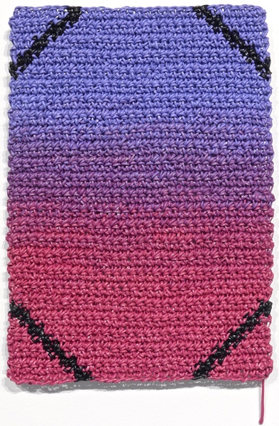
Angela Teng’s To Have and to Hold opened on the 13th of May at Equinox Gallery, Vancouver, BC, and closed on the 17th of June. Teng’s monolithic crocheted paintings are composed of literal strands of acrylic paint, effectively colliding materiality and paint in the substrate of work that historically, and in many contemporary contexts too, has been women’s work. You wouldn’t know it if it weren’t for the labeling but the paintings are apparently affixed to aluminum panels. It would be my guess that the aluminum is there to provide structure to the acrylic that might otherwise stretch over time. The arrangement of the paint and its uncanny materiality suggests an impossibility that lends Teng’s works an object-ness and tactility that perplexes, or excites, even the initiated viewer. Singular strands of paint include multiple and sometimes blended colors that lead one into a divination of method. Aside from the crocheted paintings, of which there were twelve, there was also a group of ten small canvasses all healthily marked with a single color of oil paint and then treated with flocking, essentially dusty, colored, fiber (think 1970s fuzzy black light posters, the flocking is the velvety bit). The application of flocking in this instance was much more painterly and imbued the paintings with a colorful kiss of dew, sparse and sprinkled. The series of ten was titled You’ll be Girl and I’ll be Boy. These paintings are the kind I tend to gush over, very much objects, but poetic also, and certainly engaged with colorist painting, material investigation, and the subject of gender, all of which seem to be underpinnings of Teng’s work.
The flocked paintings were certainly my favorite and their titling suggests that they, more than others, deal with gender. I’m not sure if that’s important. Each painting displays a color association: nasturtium orange flocked with blood red, pine green flocked with deep cobalt, bright salmon flocked with rusted mustard, black currant flocked with process blue, lilac flocked with gold, and watermelon flocked with celadon to name a few. The range of colors that Teng relies on in this grouping effectively denies and mystifies associations of gender and sexuality that we tend to project onto the spectrum of color. This effect is entirely hinged on the titling. Within the context of the title You’ll be Girl and I’ll be Boy the associations of color as they depend on gender seem to dissolve as we try to know one from the other.

Angela Teng
You’ll Be Girl and I’ll Be Boy
Series of 10 paintings, flocking and oil on canvas
Each panel: 10” x 8”
2016
Even if it might seem obvious, “the black and red seems pretty masculine to me…” the title upends a ready game of assignment. The work as a group transforms gender binary into a sort of revolving door of assumptions wherein there is nothing of concrete nature to be discovered. In the fuzzy giving way of one color to another the feet of taxonomy find only mossy slippage in a recursive game of naming that reveals the completely performative nature of gender. I feel like the space where two colors are equally weighted in pictorial space is an emanation of what I’ve referenced before as the third-layer, a dissociative space of gender, perhaps most normative, the degree of which is contingent upon infinite heterogeneity.
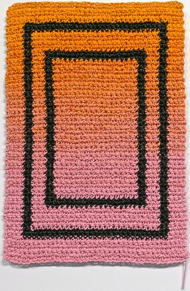
The crocheted paintings made purely of paint accounted for eight of the twenty or so works in the exhibition. They were mostly 15” x 10” and were all titled to reflect an ounce of poetry. Flip Flop, Cartwheel, Striped Petunia, Half Light, Red Halo, Dawn and Dusk, Creamsicle, and Warm Violets, Cool Forest these works seemed to be less angled at decoding or disorienting binary and more interested in perhaps reorienting surfaces of women’s work with spaces of sublime pleasure and also agency. I would say that perhaps each painting is in a way reclaiming space, or imagining in a utopian manner, from a feminist vantage.
My favorite of the crocheted acrylic paintings was most definitely Dawn and Dusk which is essentially a fade from pink to candy orange divided by a pair of dark rectangles, a smaller one inside a larger one. During the exhibition the piece was backed by a larger piece of deep red velvet, which for me really amplified the work’s tenacious color.
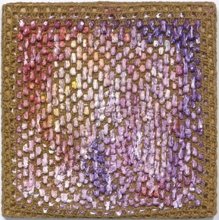
Interesting too were pieces like Slugger and Blue through Pink. The latter would seem to suggest the imposing nature of the male gaze, or perhaps the common burden that men so often offer women. Both pieces featured crocheted surfaces where paint had been pushed through the surface. Slugger is my personal favorite where oil paint is pushed through jute which is coarse and fibrous, similar in appearance to burlap. Both pieces feel at least moderately sexual to me. Their ooziness is both powerful and languid, and you can apply those adjectives where you may. There would seem to be a gesture of undermining rigid structure with liquid force of spirit. It seems very appropriate.
–Jack Wood


