
Jules Chéret, Les Folies-Bergère/La Loïe Fuller, 1893, color lithograph. Photograph by John Faier, © 2015, The Richard H. Driehaus Museum.
Sometimes it takes time for the aesthetic worth of something to be recognized. This most definitely was not the case with French advertising handbills AKA posters from its Golden Age, from 1880 to the late 1890s. They immediately attracted a passionate bunch of collectors, earning them the sobriquet affichomaniaques–poster maniacs. “L’ Affichomania: The Passion for French Posters” at the Taft Museum of Art shows why they inspired such fervor.
The contemporary collector whose collection comprises the exhibition, Richard H. Driehaus, sees the posters as both “unabashedly commercial” and “boldly artistic.” 1. It’s an apt and succinct description.
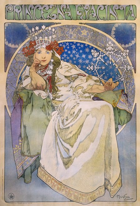
Alphonse Mucha, Princess Hyacinth,1911, color lithograph. Photograph by John Faier, © 2015, The Richard H. Driehaus Museum.
In the late 19thcentury, affichomaniaqueswould stealthily remove handbills from public display, from hoardings, walls designated for them, or from Morris columns, tall, columnar, and faceted kiosks, designed by Gabriel Morris specifically for posters. They might also buy them illegally from the billposters. Enterprising dealers began marketing proofs, prints without text, and printed posters on quality paper or silk.
“Affichomania” showcases the work of five of the leading lights of its Golden Age– Jules Chéret (1836-1932), Eugène Grasset (1841-1917), Théophile-Alexandre Steinlen (1869-1923), Alphonse Mucha (1860-1939), and Henri Toulouse-Lautrec (1864-1901).
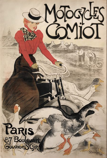
Théophile-Alexandre Steinlen, Motocycles Camiot, 1899, color lithograph. Photograph by John Faier, © 2015, The Richard H. Driehaus Museum.
Two things that made affichomaniapossible weren’t artistic developments. One was technical, an advancement in color lithography made by Chéret. The 1881 Freedom of the Press Law allowed the printing of an unlimited number of posters, each subject to a tax. The posters have a stamp indicating that the tax had been paid.

Jules Chéret, Yvette Guilbert, Au Concert Parisien, 1891, color lithograph. Photograph by John Faier, © 2015, The Richard H. Driehaus Museum.
Jules Chéret is considered the father of the poster as art form. In 1885 the French author and poet Félicien Champsaur dubbed him the “king of the poster.” In 1890, the French Government awarded him the prestigious Legion of Honor.
At the age of 13, the native Parisian Chéret, a typographer’s son, was apprenticed to a lithographer and spent the next 17 years perfecting his craft. In 1866, he opened his studio, Atélier Chaix, in Paris.
Chéret began his design career making black-and-white posters with “densely clustered figures and ornate text,” 2the prevailing style. But he soon developed his own signature look, utilizing the bold color made possible with chromolithography. He used three lithographic stones, one for each of three colors: red, yellow, and blue.
Chéret also integrated image and text and developed a simplified graphic style inspired by French caricaturists who, in turn, were influenced by the mangadrawings of Hokusai (1760-1849).

Jules Chéret, Folies-Bergère/La Loïe Fuller Émilienne D’Alençon, 1893, color lithograph. Photograph by John Faier, © 2015, The Richard H. Driehaus Museum.
Chéret created a vision of the ideal woman that was influenced by the rococo fancies of Antoine Watteau (1684-1721) and Jean-Honoré Fragonard (1732-1806). The scantily clad ladies, clearly in high spirits, were called “chérettes.” 3
Chéret showed them “dancing, skating, serving drinks, and lighting lamps. She was the perfect vehicle for sales,” according to Jeannine Falino who curated the exhibition.

Jules Chéret, Théâtrophone, 1890, color lithograph. Photograph by John Faier, © 2015, The Richard H. Driehaus Museum.
Falino goes on to say that the chérettes were “beautiful, but also active, independent, and intelligent people who went about their daily business, whether shopping, traveling, examining prints, or riding bicycles.” 4They epitomized the new independent woman who might work (in 1890s more than a quarter of the working population were women). And with changes in French law, women were now allowed to control their own funds. For them, the advertisements not only sold products, but were also aspirational.

Eugène Grasset. Salon Des Cent: Grasset, 1894, color lithograph. Photograph by John Faier, © 2015, The Richard H. Driehaus Museum.
Born in Lausanne, Switzerland, in 1841, Eugène Grasset moved to Paris when he was 30. As many poster artists did, he had become known for his designs of a range of decorative products including furniture, wallpaper, textiles, tapestries, ceramics, jewelry, and architectural woodwork. In 1877 he turned to graphic design, first producing postcards and postage stamps, but eventually becoming best known for his posters. 5
Grasset was inspired by the medieval revival style embraced by the international Arts and Crafts movement. He used rich solid colors outlined in black, an unmistakable reference to stained glass, for settings showcasing beautiful women,

Eugène Grasset, Marque Georges Richard/Cycles & Automobiles,1899, color lithograph. Photograph by John Faier, © 2015, The Richard H. Driehaus Museum.
Like in the Arts and Crafts movement, Grasset celebrated decorative surface design as seen in his distillation of river, landscape, and sky into undulating stripes in the background of Marque Georges Richard/Cycles & Automobiles.

Alphonse Mucha, Zodiac, 1896, color lithograph. Photograph by John Faier, © 2015, The Richard H. Driehaus Museum.
Alphonse Mucha, born in 1860 in Moravia, now the Czech Republic, moved to Paris in 1888 after spending time in Vienna and Munich. He had already made a reputation designing theater sets and large decorative paintings. His style was defined by his use of entwined, sinuous lines, and subtle color, the hallmarks of Art Nouveau. In 1897, he founded a magazine Art et Decorationto promote the style. Driehaus credits Mucha with elevating “ . . . . this distinctly French Style to new heights of refinement and popularity.” 6

Alphonse Mucha, Sarah Bernhardt as “La Dame Au Camélias, 1896, color lithograph. Photograph by John Faier, © 2015, The Richard H. Driehaus Museum.
By chance, Mucha became the favored designer of the great tragedienne Sarah Bernhardt. At Christmas time in 1894, he happened to be at Lemercier, his publisher, correcting proofs when Bernhardt contacted the printer. She wanted a poster to publicize the extension of Gismonda’s theatrical run. One caveat was that it had to be done by New Year’s Day.
Mucha had already painted Bernhardt so was familiar with her. He created a larger than life (more than two meters tall) image. It was the tall narrow format that he often used to increase the drama of the composition. (Gismonda measures 84” x 28”.)
Time constraints meant Mucha was unable to be as detailed as he would normally have been. He even left areas of the background blank. It was the first time that the artist created a halo effect around the subject’s head, here a highly decorative rainbow-shaped arch. He used a pastel palette, a deviation from the more commonly used bright colors.
When the poster hit the streets of Paris, it was a sensation. Bernhardt ordered 4,000 copies and put Mucha under contract for six years.
Mucha’s next design for Bernhardt was for the revival of La Dame aux Camélias, the Alexandre Dumas fils play that inspired La Traviataby Guiseppe Verdi.This design is emblematic of his style presenting stunning women in ornate surroundings with “hair curling in arabesques and filling the frame.” 7
Mucha’s style was reprised in the psychedelic art of the 1960s, showing up in the work of Peter Max, Wes Wilson, and Victor Moscoso. 8
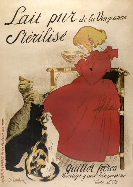
Théophile-Alexandre Steinlen, Lait Pur Stérilisé, 1894, color lithograph. Photograph by John Faier, © 2015, The Richard H. Driehaus Museum.
One of the distinguishing characteristics of the Golden Age was the integration of text and image, a design innovation introduced by Chéret. Théophile-Alexandre Steinlen was particularly adept at it.
Steinlen’s Lait Pur Stériliséis a homely domestic tableau. Wearing a red dress with ruffled collar, black sash, and voluminous skirt, his daughter, Colette, sips daintily from a bowl of sterilized milk. Three family cats–a tabby, black, and calico–stand out against the expanse of red, necks outstretched and completely focused on Colette, mewing as they hope she might share a taste. She looks unmoved.
Steinlen combines the simplicity of composition with an elegant and easily read script. The name of the product–Lait pur Stérilisé–occupies the upper left and frames his daughter’s head. The name and location of its producer is tucked under Colette’s chair in the lower right. All in all, it’s a charming scene.
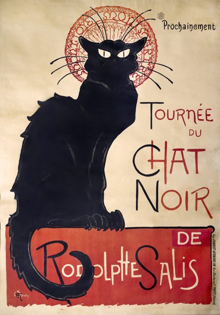
Théophile-Alexandre Steinlen, Le Chat Noir,1896-97, color lithograph. Photograph by John Faier, © 2015, The Richard H. Driehaus Museum.
Despite this cozy scene, Steinlen is best known for his scenes of Montmartre, documenting its notorious cabarets and music halls and those who haunted them–performers, patrons, and prostitutes. He is responsible for the iconic image of Le Chat Noir, The Black Cat, for the first cabaret in Montmartre, which was established in 1881 by the impresario Rodolphe de Salis.
The club’s namesake is a very different breed of feline than the domesticated pusses of Steinlen’s household. She’s a scrappier alley cat, not one to tangle with. Appearing in silhouette, her body is faintly outlined in a chalk-like white. The fur on her back and tail is spiky, but she doesn’t invite petting. Her tail is curved as if whipping back and forth to show her displeasure. Her whiskers stand out against an abstract halo, a humorous jab at Mucha’s frequent use of halos surrounding his women’s heads. Her ears are alert, her eyes penetrating. Her claws grip what could be a wall but functions graphically as a red block of color with Rodolphe de Salis’s name dropped out in white lettering. The almost aggressive cap letters, likely in keeping with ambience of this cabaret, has replaced the soothing type of Lait Pur Stérilisé.

Henri de Toulouse-Lautrec, Jane Avril,1893, color lithograph. Photograph by John Faier, © 2015, The Richard H. Driehaus Museum.
An aristocrat slumming, Henri de Toulouse-Lautrec lived in Montmartre, and chronicled the lives of its disreputable denizens. He brought the same artistic sensibility informed by Japanese prints and Edgar Degas that he used in his paintings to his graphic works.
Toulouse-Lautrec’s palette of acidic greens and yellows stands in sharp contrast to Chéret’s primary colors. And the sweet sexiness of Chéret’s chérettes looks quaint compared to the eroticism of La Goulue.
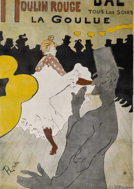
Henri de Toulouse-Lautrec, Moulin Rouge: La Goulue, 1891, color lithograph. Photograph by John Faier, © 2015, The Richard H. Driehaus Museum.
One of this artist’s most famous posters–Moulin Rouge: La Goulue– was his first. He depicted the popular dancer, La Goulue 9(The Glutton) performing the scandalous can-can, swirling her petticoats to reveal the heart embroidered on her knickers. It was said that she could flip a man’s hat off with a high kick. Toulouse-Lautrec captured the energetic abandon of the dance. The silhouette of her contortionist partner, Valentin le Dérossé, in the foreground beckons to the audience to become part of the scene.
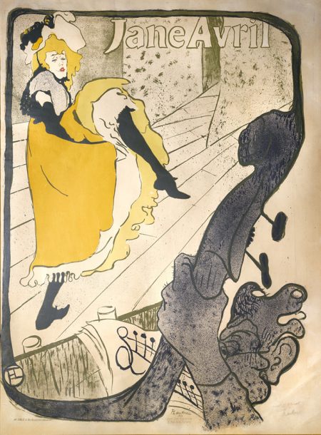
Henri de Toulouse-Lautrec, Jane Avril, 1893, color lithograph. Photograph by John Faier, © 2015, The Richard H. Driehaus Museum.
As the end of the century approached, several things contributed to the decline of the once vibrant art form. For one, its artistic leaders moved on to other pursuits. Chéret turned his talents to murals and other decorative projects as did Mucha. Grasset focused on teaching at the École Guérin from 1890 to 1903 and later at other schools. Politically left-leaning Steinlen made prints with biting social commentary that appeared in artistic and humor magazines such as Le Rire and Le Mirliton as well as socialist publicans like Le Chambard. And Lautrec died in 1901 at the age of 36.
Other factors included the fact that the quicker and cheaper half-tone process had replaced chromolithography; automobiles had reduced pedestrian traffic, so Parisians no longer strolled at a leisurely pace past the outdoor gallery of posters; and the movies had lured the public away from the cabarets and music halls.
Falino concludes, “In time the brave new world of colorful posters that had once been welcomed, promoted, and collected as an innovative art form was finally understood to be the servant of cold commerce and a nascent advertising industry.” 10
Installed in the small Sinton Gallery, “Magic and Melodrama: Cincinnati Posters from the Gilded Age” complements “Affichomania.” It features theatrical posters produced by the Strobridge Lithographing Company at the turn of the 20thcentury. Using steam-powered presses equipped for color lithography, Strobridge became a global leader for entertainment advertising.
–Karen S. Chambers
“L’ Affichomania: The Passion for French Posters,” Taft Museum of Art, 316 Pike St., Cincinnati, OH 45202, 513-684-4516,taftmuseum.org. Wed.-Fri. 11 am-4 pm, Sat.-Sun. 11 am-5 pm. Admission: members, youth 18 and under, and veterans/active military free; adult $10 in advance, $12 at door; senior $8 in advance, $10 at door. Sun. free.Through September 14, 2019.
ENDNOTES
1 Richard H. Driehaus, “In Pursuit of the Grand Masters,” L’Affichomania: The Passion for French Posters,China, The University of Chicago Press, 2017, p.13.
2 Jeannine Falino, “’The Distinctive Art of Our Time’: The Belle Époque Poster,” L’Affichomania: The Passion for French Posters,China, The University of Chicago Press, 2017, p. 18.
3 Ibid., pp. 17-19.
4Ibid., p. 28-29.
5 “Eugène Grasset,” Wikipedia.
6 Driehaus, p. 12.
7 “Alphonse Mucha,” Wikipedia.
8 Anika Dačić, “Do You Know What Psychedelic Art is?” www.widewalls.ch/psychedelic-art/.
9 Born Louis Webber in 1866 in Alsace, La Goulue was a popular dancer at the Moulin Rouge cabaret, which was located in Pigalle district close to Montmartre. She got her nickname from her habit of picking up and drowning a customer’s drink at she danced by. “La Goulue,” Wikipedia.


