The biggest current project at the Cincinnati Art Museum has nothing to do with the permanent art collections under its roof. Rather, it is a monumental set of steps—164 in all—connecting the north end of the CAM’s main parking lot to the corner of Gilbert Avenue and Eden Park Drive. At nine stories tall, it’s not to be confused with a casual stroll. It may never be fully ADA accessible, but in the coming months, additional construction of ramps will help connect the parking lot up top to at least some of the four art plazas along the way, which have been designed to display outdoor sculpture. In its opening configuration, the stairs were originally planned to display three pieces of sculpture, but as of this writing, only one has been installed, Chakaia Booker’s “LBD Duty Free” (2014), which had been initially created for display on the streets of New York City’s Garment District and then installed along Chicago’s Lake Shore Drive. Two pieces on loan from the Pyramid Hill Sculpture Park—one each by Barton Rubenstein and Tony Rosenthal– are expected to be installed later this month.
Though I’m not an architectural critic and a multi-disciplinary installation like the Art Climb falls well outside my areas of expertise, I both enjoyed and admired the Museum’s work here. They have constructed a kind of vertical park here with resting places, city vistas, and varied plantings that will be all the more lovely as they fill in over time. There are benches and rather massive picnic tables that look like sculptural elements themselves. Though its primary art function (perhaps narrowly construed) is to display outdoor sculpture, it’s interesting that the Climb has been named after an activity performed by an audience, rather than after an artist, a type of material, country of origin, or donor, as are more typical of a museum. The particularly detailed and illuminating FAQs about the Art Climb on the Museum’s website use the language of urban sociology and city planning more than the terms of art history. The Climb is part of an “effort to activate the museum grounds,” something the Museum calls a “recreational art interaction”:
Everything we know and have learned tells us that this evolution is central to today’s visual arts: casual, kinetic, informal, interconnected, democratic, boundaryless and enjoyed on your terms.
It’s like the advertising copy Walt Whitman might have written for a fitness center.
The Museum has gone out of its way to connect the Climb to hilly Cincinnati’s many (many, many) sets of steps, typically linking residential neighborhoods to commercial zones. The earliest seems to have been constructed in 1830 giving Mt. Auburn residents easier access to Findlay Market. The Museum cites Mary Anna DuSablon, who has written a Walking the Steps of Cincinnati. The book is organized into 34 “perpendicular public paths,” and estimates that there are some 30 miles of outdoor staircases to be found and explored. City documents list more than 400 separate outdoor staircases, though many are in states of disrepair.
The Museum envisions the Art Climb as part of an effort to link “multiple distinctive neighborhoods,” providing an experience that “reactivates those key historical links with Mt. Adams, Walnut Hills, Mt. Auburn, Gilbert-Sinton, Pendleton and Downtown.” I think this may be a bit of an overreach, but I absolutely felt that the Climb physically reorients the Museum. Of course, many major buildings are reoriented with some regularity and the main entrance of the CAM has changed several times since it opened in 1886. But as a visitor, I always felt that topographically, the CAM anchored a certain corner of Eden Park. It looked down at the underused band shell and Mirror Lake, out at the Playhouse, and you saw it on your way past the former reservoir as you sped to the Krohn Conservatory. With the new staircase, however, the CAM in some measure turns its back on Eden Park, and declares itself more open to the city. The steps barrel their way north from the corner of the parking lot, zigzagging slightly down the hill to the street opposite the Baldwin Building complex. Though it’s a fair criticism to note that the Climb connects the Museum’s parking lot to, well, more or less nowhere in particular, it still feels like the CAM wants to make a statement that it is grounded in the city. It is as much open to the city as it provides a retreat from it. And the CAM has gone out of its way to nestle the stairs in a park-like environment. Invasive underbrush has been cleared out, revealing some striking older trees (especially at the street level), and what looks to be a wealth of new plantings has been added. It is hard not to think that time will be generous to it as the plants naturalize and fill in the spaces between the swatches.
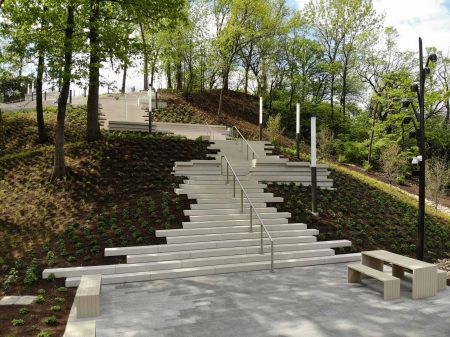
Cincinnati Art Museum, Art Climb (photograph provided)
Will it be a good place to look at the art that the CAM will eventually install in curated and rotating showings of outdoor sculpture? With no artworks currently to be seen, it is hard to tell. I was there on an exceedingly pleasant early fall day. Climbing those 164 stairs will be more of a chore on a typical Cincinnati summer day; there’s no shade beyond what some medium growth trees will provide, and there’s only one water fountain. It’s up at the very top, currently closed, naturally, for pandemic concerns. We shall have to see whether the Climb is any more or less hazardous than every other surface is on a typical Cincinnati wintery day. At the end of the Climb, there are striking views of Cincinnati’s varied architecture, old and new, in a pleasantly dizzying perspective as you look down a hill at the prospect of other hills making their way up from downtown. I also thought that from the top of the stairs, at the north end of the front parking lot, the extremely hybrid façade of the Museum had never looked so good, something like an eclectic, postmodern sculptural surface itself.
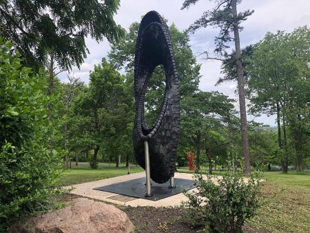
Chakaia Booker (b. 1953), United States, “LBD Duty free”, 2014, reclaimed tires and stainless steel, Courtesy of the Artist, made possible through partnership with Pyramid Hill Sculpture Park & Museum.
The one piece of sculpture newly on view in the vicinity of the Art Climb is Chakaia Booker’s “LBD Duty Free” (2014), and it is worth the trip to the corner of Gilbert and Eden to see it. A Guggenheim Fellowship winner in 2005, Booker is an African American artist who was born in Newark in 1953. Her work has been seen in a Whitney biennial and is held by more than 40 public collections. “LBD Duty Free” was originally designed as a part of a substantial five-piece installation in Manhattan called “The Sentinels.” Like most artists, her medium is part of her message: she constructs her pieces, which are often ten or even twenty feet high, from scraps of tires fixed over stainless steel armatures. Booker has spoken eloquently about how rich a material she has adopted as her own: the surface, she commented, “suggests archeological finds and the deciphering of patterns and textures into new languages or new symbols.”
“LBD Duty Free” at first glance might look just a little like a corporate logo, the sort of piece you’d find on the sidewalk in front of a glass tower. But the initial simplicity of its shape is misleading in two ways. The first is that the shape itself—a pair of loosely linked ovals veiled by a sheath of black rubber tiles—is richer than a first impression suggests, with the armature taking some pretty tight turns, like a wild steel roller coaster at King’s Island. But it is also in the nature of Booker’s work to enrich her geometries by the extraordinary variety and evocativeness of her surfaces. The stainless steel tubing, for example, is wrapped in segments of tires so that they look like the vertebrae of some infinitely malleable spine. These surfaces enrich the framework with a dazzling array of irregularities, and make the industrial materials as varied—and surprisingly detailed—as if they were a painterly surface. Booker speaks about how the detritus she works with becomes a metaphor for “cultural diversity in this society”: the scrapsmay retain wonderful visual patterns that come about between the layering of metal treads and the rubber-gluing agents. Sometimes it’s rust stains; others, it’s the textures, the treads that remain, the movement and coloration that come to me when picking up a piece.
Booker’s sculpture makes something richly organic out of inorganic materials, each piece a golem. The surfaces are like rippling skin, calling to mind the scales of an imaginary reptile—or alien. The small black pieces may at first look uniform and monochromatic, but some have white painted markings on them, and all are pulled together by patterns of screws holding the rubber to the steel armature with the grace and energy of hand-drawn pencil markings. There is an elegant and monumental draftsmanship in the stitchery. There is something brash and punk about it, and something as timeless as basketry, often in a kind of counterpoint to the broad geometric outlines of the whole.

Chakaia Booker, “LBD Duty Free”, 2014 (detail).
The remaining two sculptures to be installed were still in residence at their home at Pyramid Hill Sculpture Park in Butler County, which I visited for the first time on a lovely, early fall day, where an unusual lack of rain had let the lushness seep out of the surrounding landscape, forming a perfect, pale backdrop to the pieces I saw. Pyramid Hill, which opened to the public in 1996, represents the vision and collection of Harry Wilks, a lawyer and Miami grad (and subsequent benefactor) who used his fortune made from investments in stocks and real estate to create one of the nation’s most substantial outdoor sculpture venues. Its collection currently totals about 80 pieces, most collected or commissioned by Wilks, Executive Director Sean FitzGibbbons told me. It sits on 300 or so acres of rolling Ohio scrub brush, which Wilks helped parcel and arrange into sites for sculptures, roadways for cars (and even golf carts you may rent), and walking trails. For comparison, Storm King Art Center, located about an hour’s drive north of New York City and the gold standard against which sculpture parks are measured, has been open for 60 years. It owns about a hundred pieces spread out over 500 acres.
It’s plain to see what Pyramid Hill isn’t. It’s not a museum with a representative survey of individuals or even movements essential to understanding the history of modern and contemporary sculpture. There’s nothing by Moore, Giacometti, Smith (David or Tony), Calder, or Caro. Some movements in sculpture simply didn’t seem to have interested Wilks. There’s very little that shows the influence of Pop and its playing on casting familiar shapes in an unfamiliar scale. There’s nothing that requires electricity or that moves. There’s nothing impermanent (like, say, Patrick Dougherty’s “Far Flung,” his installation of twisted willows that was on view in the front yard of the Taft Museum for a couple of years). There are no earthworks or environmental sculptures or, that I could tell, fully site-specific pieces. The collection is less diverse in its choice of artists than one might like, with only 10 per cent of the sculptures, for example, having been done by women artists (so no Beverly Pepper, Barbara Hepworth, Louise Nevelson, Deborah Butterfield, or Louise Bourgeois—though one of her monumental spiders would look truly great out there). And the figurative works that I saw were considerably less striking than the more abstract ones.
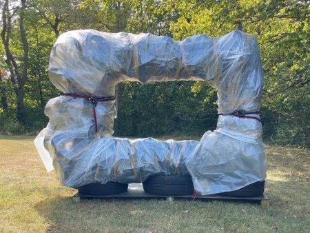
Chakaia Booker, “Take Out” [wrapped for transit].
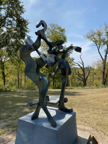
Bill Barrett, “Venus and Psyche”
But the works I saw were generally perfectly smart about materials and almost without exception serious in their thoughtful attention to formal concerns. Some were lyrical, made of winding curves and intertwined metal (abstract versions of the neo-Baroque), like Bill Barrett’s “Venus and Psyche” which looked like it had been painted three-dimensionally in steel. Sometimes Wilks was drawn to colorfully painted pieces (he was clearly not above thinking that a piece of sculpture could be both serious and fun) like Clasina Van Bemmel’s “Looking At It, Looking From It.” Sometimes he collected plain steel works polished to a dazzling gleam, like Michael Tearney’s “Triumph.” Ken Valimaki’s “Landing” (1989) consists of 5 geometrical steel pieces in a sort of conversation with each other. Valimaki says that the piece “sprawls and covers a lot of ground with pauses in between.” If they were any closer together, they’d be a jumble, and if they were any further apart there wouldn’t be enough tension between the elements to hold them together. As it stands, they sit very eloquently in a clearing that seems designed for them, their dark geometry eloquently set off against the pale green, organic shapes of the woods a couple of dozen yards behind them.
I would have loved to be a fly on the wall when some of the decisions were being made about where to site the works in the Pyramid Hill collection. George Sugarman’s “City of Sculpture” (1989) spreads out over a considerable expanse, with larger than life Adirondack chairs, cartoonish giant tulips, and other imitations of a garden experience. It is, I think, as close as the collection gets to a Pop-influenced piece. The tallest piece is 22 feet high. It is made up of eight individual sculptures spread over 7500 square feet. They hold the top of the hill they’re on beautifully. It is a little like a brightly colored dollhouse for giants. Although the park rules include not climbing on pieces, the chairs and benches are available for sitting. Sugarman himself has said that “the presence of people completes the composition. Without them, it has only latent energy.” This serves as a reminder that a sculpture park is in danger of being a pretty static and monumental place, and it makes you yearn for the organic.
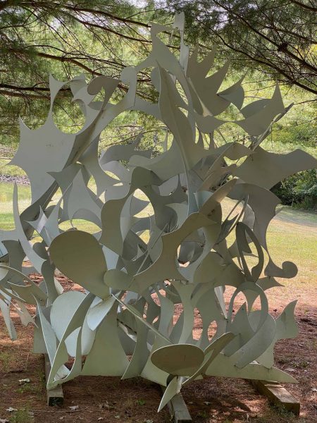
Alexander Liberman, “Laocoon”, 1982.
Occasionally, the monumentality of installations at a sculpture park can get tiresome. How many pieces can be placed at the top of a hill sheared of trees and bushes, standing out against the sky with just a bit more heroism than can be supported? But I have to say that I don’t know if I have ever seen a piece of sculpture as handsomely sited as Alexander Liberman’s “Laocoon” (1982), the earliest of three Libermans you can see at Pyramid Hill. I couldn’t say that I immediately saw its connection to the famous Hellenistic sculpture aside from its bone-white color, but I’d be willing to keep looking. Perhaps the connection is in the way the pieces twist and turn around each other, like the arms and the alarmed glances in the Greek original. Made of a blizzard of uncharacteristically smaller elements than many other Liberman pieces, it looks like a mass of albino leaves caught up in a dust devil. But instead of standing on its own at the center of an empty field, “Laocoon” has been placed by a small pond in the shade of some pine trees, where dappled sunlight hits it. Light becomes its full partner, and I feel confident that it changes as the sun moves even more than pieces fully out in the open. It seems a perfect example of what Pyramid Hill hopes to accomplish by offering, as Director FitzGibbons notes, a “natural experience for our guests. Pyramid Hill is a living park…and much of our programing is based within ecology and biology” as they interact, sometimes improbably, with monumental works of art.
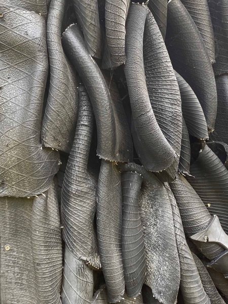
Chakaia Booker, “Shhh”, 2014 [detail].
–Jonathan Kamholtz


