Editor’s Note: This show has been extended until August 15, 2021
In writing about Bukang Yu Kim’s extraordinary solo show of ten paintings at the Dayton Art Institute, I need to make two disclosures. First, I confess to coming late to an appreciation of her marvelous and powerful work, though I’ve had plenty of chances to have done so in the past. She had a one-person show at the Cincinnati Art Museum in 2014, and has appeared over the years in group shows with some regularity at Cincinnati Art Galleries. My second disclosure is that I have not been able to actually see this show in person. The Dayton Art Institute has been closed to the public for the whole run of the exhibition, initially out of a concern for COVID and then more recently because of a boiler fire that has caused some havoc with the museum’s heating and humidity systems. On the other hand, the show has been superbly documented. Brad Smith has taken publication-quality photographs of each of the works, and the DAI has assembled them into an outstanding online brochure (https://issuu.com/daytonartinstitute/docs/bukang_20kim_20digital_20brochure_20final?fr=sYTBhMDE5MTYwNzQ). There are even installation shots available to give a sense of the works’ scale and how they feel and function together in the space of an enclosed gallery.
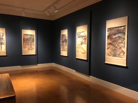
Bukang Y. Kim, “Journey to the East,” installation shot, Dayton Art Institute
Kim was born in Korea in 1943 and came to America in 1970. Eventually, she took an MFA degree from the University of Cincinnati and has been exhibiting regularly at home and abroad since then. In a review of her CAM show, Daniel Brown, Aeqai’s editor, has written what is surely the essential piece about her work thus far, setting out many of the crucial terms for appreciating her art (Aeqai, December 2014). He wrote about how she freely and excitingly combines elements of the goals and techniques of Asian art with modern western painting. Though Kim clearly has an outstanding sense of many of the cross-currents of American art across the last half century, it felt to me that she has looked particularly carefully at Cy Twombly for his exploration of the relationship between what is drawn and what is written, and Joan Mitchell, for her sense of how the almost frenzied energy of painting can end up producing a painted world that is lyrical and serene. For Kim, the combination of Asian and American results in work that is close to nature and deeply abstract, as needed; it is both sharply observed and deeply felt. Brown notes that she is particularly sensitive in her observations of natural light but also pursues a more spiritual light. And finally, he has written of her calligraphic brushwork, which functions on both expressive and representational levels.
All of these issues are in play in Kim’s Dayton show, which had its roots in a trip she made to Siberia in the late 1990s. Subsequently, she decided to do a series of paintings based on her photographs and memories. If Siberia strikes us as an unlikely inspiration for a study of landscape, that seems, in some part, to have been the point. (One theory about the origin of the term “Siberia” is that it comes from the Tatar words meaning “sleeping land.”) Though the immensity of Siberia is in fact topographically varied (there are plenty of mountains, rivers, and lakes across its 5 million square miles), we tend to think of it as bleak and empty, and it is precisely the bleakness and emptiness that Kim has taken on as her subject matter. She has described Siberia as “bold, wide, wild and without much color.” This is a challenge to a superb and expressive colorist like Kim, who decided in this show to make pictorial drama out of the restricted palette she has chosen to accept. More broadly, I would say that the challenge that Kim gave herself in “Journey to the East” was to work with the essential elements of landscape while drawing inspiration from a place that itself lacks many of the most gratifying elements of landscape. From beginning to end, the show plays with the idea that “landscape” is both a mode of painting and also a way of seeing and organizing natural topography. It is what the artist has to work with and what the artist does.
If you take away the picturesque—that is, if you take away the idea that there are conventional scenic beauties in what you see that are worth capturing—of what is landscape art then composed? The show as a whole is a master class in examining and working with the formal elements of landscape as painting. And though I talk about these in formalistic terms, I would say that Kim feels the interplay of these formal elements so deeply as to be thrilling. For Kim, landscape starts with the horizontal stroke that marks the horizon. It’s often in the distance but can also be so close to you that you feel as if you could reach out and touch it. It can be dull or bright, sharply distinct or hard to differentiate between the sky above it and the ground below. Next, there is the presence or the hope of something vertical. The vertical in a landscape boldly defies entropy. It’s something that grows up out of all that plain space, giving it shape and proportion. Even a single tree, as the series suggests, will do handsomely.
Perhaps from Twombly, I would next count the scribble as an indispensible element of Kim’s landscapes. On the surface of the painting, they look like writing—the rhythm of a hand at work, making marks with the opacity of a code. In the world represented by the painting, the rows of evenly spaced short marks seem to suggest a possibility of growth and life, energy ready to be let loose. There are lots of other significant formal elements—the interplay, for example, between the dry, rough mark, and wet, dripping one: this will turn out to be particularly important in “The Journey to the East” because it seems as if it is an arid landscape being depicted that only occasionally allows water in. But I want to call particular attention to the diagonal stroke as a crucial formal element for Kim. In part, it is a kind of reconciliation, naturally, between the horizontal and the vertical. But it also serves in the European tradition of pictorial representation as an abbreviation for perspective, for the line that offers an entrance, suggests motion, and by its mere presence designates the potential for energy, for the viewer on the outside of the painted surface to enter into its world, even when inside the painting it suggests a world at rest. It functions on the two-dimensional surface of the painting as a part of the elegance—or bustle—of the composition, and in the representation of space in the recessional, three-dimensional world depicted in the work.
Each of the ten works in “Journey to the East” has been painted in oil and drawn with charcoal upon sheets of 3’ by 2’ mulberry paper which are then mounted on scrolls. It was my sense that this show constitutes a suite rather than a collection—a highly curated series that suggests an encounter where the formal elements of landscape are depicted as being engaged in a dynamic process of evolving and dissolving. Seeing them is not unlike seeing the half dozen or so versions of Monet’s haystacks in Chicago. Though some of the individual pictures seem to be in particularly close conversation with others–#1 and #8, for example, or #2 and #3, and #5-7—taken as a group they suggest a formal and spiritual narrative that I found absorbing and even moving. The narrative is not literal in the least, but speaks about the situation of a painter working with an unprepossessing landscape. From picture to picture, we see her moving step by step on her way to making bold and powerful decisions about what is within the means of a deeply resourceful artist.
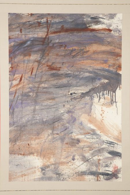
Bukang Y. Kim, “Journey to the East” #1 (1999), Dayton Art Institute (photo credit Brad Smith)
The first one in the sequence is, naturally, a kind of overture, crowded with the elements that will be explored and played with in the rest of the series. The colors are warm but dour: mostly greys and browns, though there is a hint of purple on the left. An ochre slash near the top suffices to suggest the horizon. Perhaps I have been trying for too long to make things grow in Cincinnati’s stubborn, muddy clay, but ochre seems like a color at the tipping point between life and death: is it the color out of which we hope to see things grow or the reason why nothing will ever take seed? There is a virtually identical patch of grey on either side of the horizon line; this is what overcast truly feels like. We can see a patina of lightly scribbled markings that suggests the potential of something coming to life. Towards the right and virtually in the center, there is a stroke of grey so wet that it drips. In turn, it calls attention to a streak of faint brown wet dots, each with a small halo around it, that run down to the bottom. Things may be formless but the implication is that we shouldn’t give up: this is a landscape with potential.
Numbers 2 and 3 work closely together. The horizon line has dropped a little lower—do we feel closer to the observed world? Indeed, the landscape of #2 seems to be made up of horizon lines. It is also wetter: the ochre paint runs into drips, but the grey does as well, and in the sky above the horizon line, even the purple flows down in streaks. The sky is no longer indistinguishable from the land beneath it. This is the drama of Genesis, the drama of making form out of things that initially seemed formless. Between the drips and some long, linear vertical marks, we are being asked to acknowledge the simultaneity of two different realms: the painted two-dimensional surface of the scroll and the three-dimensional world that is loosely being represented. Number 3 continues working with these elements with a number of important distinctions: for one, the zone above the horizon line is now a mix of white and grey and is characterized by some lovely curving lines. It seems hard not to see it as a clearing sky, puffed with high riding clouds. It feels as if a weight has been lifted. Is it also fair to think that some of the wetness from #2 has been absorbed into the land. The modes and strategies of abstraction and representation are in a conversation with each other. I think that by #3, we are being asked to discern ways that some of the tools, conventions, and logic of landscape painting can help make sense, beauty and order out of a plain and resisting topography.
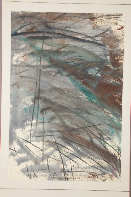
Caption: Bukang Y. Kim, “Journey to the East” #4 (1999), Dayton Art Institute (photo credit Brad Smith)
There is nothing else in the series quite like #4. Where the first three saw a kind of kinship between grey and ochre, here the kinship is between grey and a blue so cool and bright that it might be turquoise. There is the least warm brown here of any of the series; the horizon line seems to be done with a greyed-down cobalt blue. The dominant design feature is all the diagonals; I found it hard not to read them as water moving towards me. Overlaid over the paint are charcoal markings, some of which have become elongated and stretch the length of the scroll. In the visual language of this series, it seems strongly suggestive of the trunk of a tree, a vertical form that will emerge in the next few pieces, make its presence known, and then disappear, echoing the way that shapes interrupt and give form to the shapelessness of scenery that is, as Kim observed, wide and wild. This one also seems like the beginning of a serious interest emerging throughout the series in the weight and value of empty space. It is a kind of alternative to the hectic busyness of the rest of the painting and suggests both where things in any painting begin and end.
I saw #5-7 as a kind of sequence within the sequence, a three part drama about a vertical presence that seemed to me to be a tree. In #5, two painted dark lines converge slightly as they work their way to the top of the scroll and about a third of the way up, burst into leaves. (I have seen works where Kim had painted trees in a forest that looked very similar.) It seems to be a natural outgrowth of the calligraphic markings of the previous pictures, a thing they can coalesce and ripen into. The horizon is a sort of miracle, a bright, orange-red—almost cranberry—streak that goes halfway across the paper until obscured by the tree. The drama of forms that emerge and then are absorbed continues in #6. The tree-like shape is less explicitly defined, though there are still networks of vertical lines, some in ochre, some in charcoal, some in white paint. They don’t quite come together into a single form, but they echo repeatedly the shape of the tree trunk. There is a lyrical curve in the foreground, practically an arch, that softens everything. If #6 centers on a tree and its ghostlike doubles, in #7, we just have the ghost. Two roughly parallel white lines suggest a tree that is not there. It seemed to me that it was open-ended whether the land being depicted no longer needed to rely on the presence of the tree or the artist no longer needed it to organize how the landscape looked or felt. A couple of rows of calligraphic markings once again suggest the possibility of more modest life emerging from the washes of gray and brown.
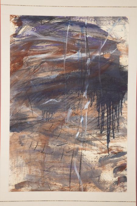
Bukang Y. Kim, “Journey to the East” #7 (1999), Dayton Art Institute (photo credit Brad Smith)
Numbers 8 and 9 return to more conventional horizon lines. In #9, there is once again a cranberry-colored horizon, though there are also beautiful red marks throughout the painting. These two struck me as among the most abstract of the series, emphasizing two significant formal elements. Both of them rely more on the device of the diagonals (which started to appear in #3) taking the place of virtually anything vertical. And they both start to pick up (as had #5) on the value of empty space, of the places on the paper where there is neither paint nor charcoal. The surprising weight of empty space can balance out large areas filled with lines, marks, and washes.
The series comes to an extraordinary conclusion with #10. It is, in some ways, the most austere of them all. In tone and feel, it is most like the first one with a color scheme of only grey, ochre, and black. But though it may suggest a circularity to the body of work as a whole, we are not really back to where we began. In terms of the composition, it re-envisions both the tree and the diagonal by combining them. If what it took to suggest a tree was two slightly converging dark vertical lines, here those converging lines are on the diagonal, pointing their way across the paper to the top of the page. The ghost tree has been reoriented—and repurposed. This suggests, I feel, both a synthesis between the horizontal and the vertical of any landscape and the implication of a pathway to take us deeper into the world of the painting.
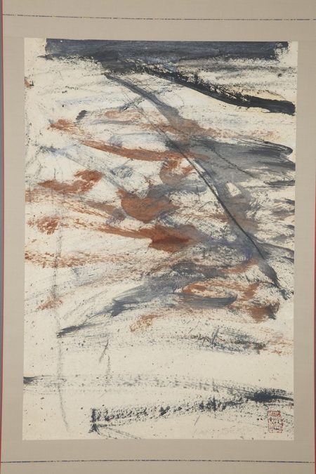
Bukang Y. Kim, “Journey to the East” #10 (1999), Dayton Art Institute (photo credit Brad Smith)
This final work in the series also has by far the most unmarked surface. And yet it is hardly minimal. Kim demonstrates here the power of plain, unadorned space. It is from that blankness that things can emerge. Landscape—and inspiration—can be found in even the unpromising bleakness of the Siberian topography. In the rich code of “Journey to the East,” the nothingness of the blank page may suggest lifelessness, but it also is a way to see a world that is unformed, uncrowded, and serene. The blank page stands ready to accept the dense and dirty ways through which life will find a means to emerge. It also is prepared for the teeming and delicious delirium of the artist’s lovely marks.
–Jonathan Kamholtz


