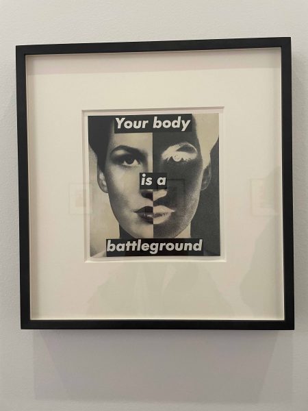
UNTITLED; (YOUR BODY IS A BATTLEGROUND) analog work – photograph and type on paper, 1989, Glenstone Museum, Potomac, Maryland
The apparent art works of Barbara Kruger are instantly recognizable. She is most known for her collage style that consists of black-and-white photographs, overlaid with declarative captions, stated in white-on-red Futura Bold Oblique or Helvetica Ultra Condensed text. The work is overlaid with phrases that often include pronouns such as “you”, “your”, “I”, “we”, and “they”, addressing cultural constructions of power, identity, consumerism, and sexuality. Kruger’s artistic mediums include photography, sculpture, graphic design, architecture, as well as video and audio installations. Barbara Kruger is considered an American conceptual artist associated with The Pictures Generation.*
Are her works giant billboard ads accidentally placed in the Art Institute? Is her work actually art?
It is easy for an average person to be confused wondering if they are viewing art when viewing the massive exhibition presented at the Art Institute. Viewers are bombarded with huge renditions of her favored bold text papered over all surfaces, the entire floor and walls of the entrance room of the Morton Wing and the Griffin Court—an 8,000-square-foot atrium running the length of the Modern Wing—with new site-specific work.

Entrance to main exhibition
After a year at Parsons School of Design in New York, Kruger worked over ten years in graphic design for magazines, freelance picture editing, book jacket design and became head designer at Condé Nast Publications. Initially she worked as a designer at Mademoiselle. Shortly after, Kruger was awarded the position of head designer for Conde Nast.
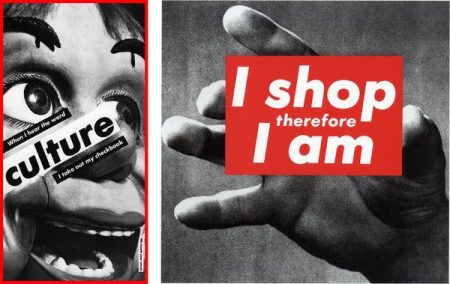
It is Kruger’s graphic design work at a women’s magazine that in my mind set up the trajectory for her searing feminist critique lasting over forty years. She had lots of fodder to work with just sitting in her lap. Designers needed ads to seduce consumers to buy buy buy their handbags, wrap dresses, high and low couture wearables. “I Shop Therefore I Am” of 1987 is perhaps her most famous work, adapting the text from the French philosopher Rene Descartes “I think Therefore I am’.

“I Shop Therefore I Am” 1987
Then there were the beauty products. The global beauty industry at present is about a 483 billion dollar industry. “You Are Not Yourself” shows a woman’s face fractured in a broken mirror, as if to tell us that we as women look in the mirror and don’t perceive a whole, balanced and worthy person. The beauty industry points to all the ways we are not perfect, not acceptable as is. One of Kruger’s recent works is of a luminous, languid, blonde Paris Hilton lying back with her glorious platinum mane of hair swirled around her face, and the caption “just be yourself.” As if.
By 1979 Barbara Kruger stopped taking photographs herself and began to employ found images in her art, mostly from mid-century American print-media sources, with words collaged directly over them. Artists routinely do this now but it was far less common a practice then. So by freeing herself to do “curbside shopping” for images instead of having to be at a specific site with her camera and with specific individuals who she might wish to feature in one of her works (which I’d simply call Critiques since they aren’t paintings nor drawings nor fine arts prints,) Kruger could up her production and increase the bandwidth of her critical oeuvre.
For the skeptics who can’t imagine an artist using their graphic design or commercial beginnings as an acceptable base for making fine arts, we need to look no further than the artwork of Norman Rockwell and Andy Warhol. If any one of Rockwell’s lovely, Americana-styled paintings was photographed with the Life masthead (bold caps on a red background-obviously Kruger paid attention to that!) in the upper left, it was commercial art, a commercial commission. If the same painting was exhibited in a gallery it was fine art. Andy Warhol made the smooth transition from commercial artist to being the darling of the Pop Art Movement in the United States. In his early career, Warhol was a product marketer and commercial illustrator, mainly drawing shoes for adverts in Vogue, Harper’s Bazar, and Glamour magazine in the 1940s. In his fine art, he reimagined famous American brands in the pop art style, such as the famous Campbell’s soup can.
There is a substantial list of laudable artists who began in the field of graphic design. Lucas Cranach the Elder is said to have designed fonts. The relationship between the artist and advertising begins at the advent of advertising, in the late-19th century. Alphonse Mucha was a prolific Czech painter and decorative artist, and his distinctive Art Nouveau style led to his wildly successful posters for a range of products, from French biscuits to Moët & Chandon champagne. Some of these lush posters were featured several years ago in a Mucha exhibition at the Dayton Art Institute. Even Salvadore Dali did commercial design work and earned the nickname ‘Avida dollars’ (‘eager for dollars’) by Surrealist poet Andre Breton.
If anything, Barbara Kruger’s persistent use of Futura Bold Oblique or Helvetica Ultra Condensed in text boxes makes her both instantly recognizable and easily imitated. The hip-hop styled high-end clothing brand “Supreme,” launched in 1994, created a red box logo with “Supreme” in white Futura Heavy Oblique is recognized to be largely based on Barbara Kruger’s art. The founder openly admitted this in a video on the development of his company after seeing a book on her work, which he gave to their graphic designer. So in this intentional loop of borrowing/stealing/appropriating some work comes out as fine art in a museum and some ends up as a clothing line with a bold red and white logo. Does this bother me? No, in a world with the elusive Banksy having a wildly expensive art work start shredding itself during the auction and the irreverent Maurizio Cattelan duct-taping a real banana to a gallery wall which he titled “The Comedian,” we don’t have much left to be ruffled by. I am too tired to comment heavily on such “events.”

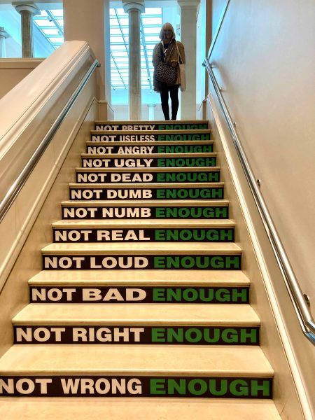
Staircare Installation
But with Kruger, her honestly heartfelt outrage at injustices, imbalances and hypocrisies finds a real place in her abundant corpus. You don’t have to like her terse, consistent style. But her message, her searching, her not letting up is utterly commendable. Her commercial remaking of these seminal analog works holds up astoundingly well in enlargement. They practically stupefy. Then she doesn’t stop there. She makes some of her seminal works such as “I Shop Therefore I Am” into a nearly floor-to-ceiling highly charged video! The exhibition is worth the drive to Chicago just to see how she has morphed some of her work and moved into the seductive arena of video. All of her videos in the exhibit are riveting. Yet the work clearly has her unique stamp on it. To my mind, Kruger takes any medium she wants to work in and she makes it her own, visually and aurally clobbering us with her astute messages. Carry on Barbara Kruger, Carry on.
–Cynthia Kukla
*”The Pictures Generation was a loose affiliation of artists, influenced by Conceptual and Pop art, who utilized appropriation and montage to reveal the constructed nature of images. Experimenting with a variety of media, including photography and film, their works exposed cultural tropes and stereotypes in popular imagery. Most important among these artists was John Baldessari who still influences artists over the generations.


