
When I was an undergrad I fumbled into Sharon Butler’s essay “The New Casualists” published in “The Brooklyn Rail”. I found it at a crucial moment in my development as a painter. It was 2011 and I was searching for a reason to keep painting. I had recently discovered the depth and breadth to which Painting was thought to be dead. And here I was, trying to make paintings and, more importantly, desiring to make paintings without a proper reason as to why.
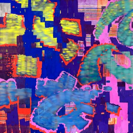
“Siasec Yem”
2012
Oil, acrylic and pastel on canvas
90 by 90 in.
Courtesy of the artist and Mitchell-Innes & Nash, NY
Butler didn’t waste any time getting to her point, and in the second sentence proclaims, “In the competitive maelstrom of 20th century art, those philosophies [Cubism, Abstract Expressionism, Minimalism. . . ] became dogmas, and the dogmas outright manifestos. In the new century, many abstract painters are saying goodbye to all that didactic thinking and exuding a kind of calculated tentativeness.” She goes on to list a group of artists, including Keltie Ferris, that have abandoned making “good” paintings and have instead decided to make paintings that are obviously about the act of painting, or perhaps more interestingly, the behavior of painting.
Born in Louisville in 1977, Ferris offers a fresh approach to abstract painting and the exploration of the artist’s identity through the body. Featuring artworks from the last eight years, Keltie Ferris: *O*P*E*N* celebrates an artist who thoughtfully examines the language and history of painting and the meaning of being an artist today. For the past fourteen years Ferris has employed techniques that defy expectations. Using spray paint, she adopts a language associated with graffiti and home décor and deftly applies it to her canvases, creating effects which range from pointillist explosions and vibrational blurs, to arabesque curves and swirls of lines. Her use of the palette knife, particularly in recent years, led Ferris to build up thick impasto areas of color that project forward on the canvas, enhancing the illusion of depth.
*O*P*E*N* contains works that are a few years old and very idiosyncratic. In the smaller gallery you’ll find some body prints akin to David Hammonds that, as an artist, I find problematic, and last, a handful of new works that are very, very exciting— I wish we had more of these. That being said, overall, *O*P*E*N* is a great introduction to Ferris’s paintings— it opens with her most recognizable and approachable pieces, presenting a sense of establishment or style, then progresses to her newest work— perhaps aesthetically demanding comparatively speaking, and a bit more historically challenging.
In viewing this work digitally one could easily assume the viscosity or matte / gloss spectrum would lean toward the smooth, semi-gloss consistency due to their high color saturation. But the works pleasantly surprised me in their matteness—even chalkiness. The reason I mention viscosity is the hefty amount of critical observation that relates Ferris’ work to that of the digitally manipulated image. Suggesting that the paintings can swing to and fro in between pixelated and blurry. . . or perhaps encrypted and flat file. . . grants an implication that the work would be sleek despite the process with which they were created (which for reference is with a palette knife akin to a putty knife and auto-paint spray guns). Allowing the paintings to appear chalky, dry, or impasto-ed alleviated the paintings from the responsibility of being pretty. Considering the color palette, the work had the opportunity to be a study in pleasant moments within the color wheel. Cadmium reds next to pure ultramarines, teals, neon fuchsias and thinner violets and so on. . . and this would have been fine. But in allowing them to remain chalky, they get to consider bigger things, be more complicated, and have a little rowdiness to them.

“!@#$%^&*()”
2010
Oil, acrylic, oil pastel and spray paint on canvas 80 by 80 in.
Courtesy of the artist and Mitchell-Innes & Nash, NY
Siasec Yem (2012) is a great example of this phenomenon. The work consists of swirled or dashed areas filled with airbrushed marks of one particular color: in this work, those areas are filled with blue-greens, cyans, and yellow. Overlaying, lying under, or sitting next to these selected areas, are opaque applications of cobalt and ultramarines, violets, and these cadmium reds that I mentioned. This composition is busy, dizzying even, but’s it’s so fun that you forgive it. Somewhere within the layers of this composition are oil pastel linear marks in a variety of colors, and under those is a thin wash of that wonderful cadmium red. There are a handful of styles of mark making within this composition and absolutely none of them include a ‘hand painted’ or ‘brushed’ mark. It’s also, probably, one of the most approachable paintings within the exhibition. Its sense of space is somewhat respectable; there is a relatable and understandable sense of depth that doesn’t cause any alarm in the viewer. A point of comparison might sit with !@#$%^&*(), where blurred marks and blocking out create a tension of confusion that is visually intriguing, but could have the potential of conflict if you are seeking placation in looking at paintings in a museum.
There are about seven paintings that fit within this approach in the gallery, but I’d like to move on to the newer work by Ferris that are installed within this same space. Included are several works that are from the last year or so and are light years away from works like Siasec Yum, made just six years ago. The color palette is downright minimal compared, especially in the example of Dives (2018), to the works that precede them in the space. They include some increasingly obvious nods to digital programming—such as the “polka-dot” pattern or the “auto-filled” blocks of impasto that feel sculptural rather than painterly. But the wonder in these paintings are the huge swaths of ‘swiped’ gray / white marks that make shouted references to Christopher Wool’s newest paintings. They are the flattest marks on the composition, and as I’m looking at them on my laptop, I’m realizing how high within the visual plane they sit above the other colors. The fact is, they aren’t above anything. The mark doesn’t wrap over the three-dimensional sections—they push into them— or rather, they push them out of the way. Excellent. Where Ferris’ earlier works are are forcible in terms of color and voracity, these are subtle and questioning—but much more confident, less needy. They don’t require force when they possess the power to convince.

“Dives”
2018
Oil and acrylic on canvas
96 x 77 inches
Courtesy of the artist and Mitchell-Innes & Nas
I’ll briefly touch upon the body prints, because they are lovely and deserve mention, but I also want to make a request to a public that put an artist in this position in the first place. Upon the wall of the gallery you can find an explanation of the Body Prints:
“The body prints of Keltie Ferris convey the idea of both presence and absence. Ferris describes these prints as an attempt to bring herself and her identity into the work in a very literal way. After exhibiting her paintings publicly for several years, she found that her audiences often wanted to know more about her identity as a woman painter, or a queer painter, or as a painter in her early or mid-career. Ferris explains, “The body prints were my way of saying, “Well, if you need me, here I am”.
Do we see where this is problematic? Perhaps I am projecting my own feelings as a female painter early in her career. . . but why, if you’re work isn’t about you, or your identity politics, do you need to discuss it? And more importantly, why is our public saying that they are owed that information. That it is required. Why are we fetishizing the artist identity for our own consumption to the point where they feel obligated to provide it? To actually declare, “well . . . here I am.”. . . This being said, all of the works are substantial and work as a lively response to the other, bigger ticket exhibition, Picasso to Pollock: Modern Masterworks from the Eskenazi Museum of Art .

Installation view of M\A\R\C\H at Mitchell-Innes & Nash, NY, 2017
Courtesy of the artist and Mitchell-Innes & Nash, NY
Keltie Ferris: *O*P*E*N* will be on view at the Speed Art Museum until February 3rd, 2019.
–Megan Bickel