

Truth to Power
The history of poster art and/or the “art poster” is surprisingly short, beginning with French lithographers in the 1880s, often produced by artists trained as painters, yet created for commercial ends: advertising a product, place, service or event. From this point of view, not much has changed. But posters have also been used to express political points of view, to propagandize or proselytize.
Nowhere have these two tendencies attained greater stature than in 20th century Poland, a country whose changing borders and changing occupiers brought changing languages and cultural habits – Napoleonic France, Russia, Austria, Prussia, Nazi Germany and the Soviet Union. Polish artists resisted and poster art bloomed, first through celebrations of their own Slavic historic traditions and later reacting to the artistic movements of their European neighbors. Even the imposition of social realist demands sometimes yielded starkly modern looking poster art, from artists like Wlodzimierz Zakrsewski, Tadeusz Gronowski, Henryk Tomaszewski and Tadeusz Trepkowski. Trepkowski’s basic premise in poster design was characterized by critic Danuta Boczar as “the challenge of the artist to draw upon the viewer’s vast and hidden store of associative capacities, encouraging the viewer to participate actively in the reception of the message.”
It is an approach which continued to characterize Polish poster art through the ’70s and ‘80s as the strict demands of the Soviet authorities had relaxed somewhat post-Stalin, and limits were pushed while artistic individuality was celebrated (especially in cinema posters). As another Polish critic, Zdaislaw Schubert, wrote: Both the concepts and designs were based on the premise of the social mission of art, inherent in the consciousness of Polish society. Thus the poster ceased to be a mere means of presenting an object or service but began to interpret and comment on it. The poster began to function as a specific branch of art, ruled by its own principles… as its own means of expression, that the poster, despite its natural limitations, can be as sensitive, elastic and deep a way of expressing the author’s attitude as any other branch of art.
The tools employed, usually more obliquely than in Western poster art, are symbolism (based on common cultural iconography), metaphor, and analogy (two or more supporting ideas enhancing meaning). The transcendent, often poetic quality of Polish poster art led Steven Heller to wonder retrospectively in 1995, “Could it be that repression produces the best art? Are artists enlivened by the idea that visual language can subvert the tunnel vision of the state?” (Of course, it also can be asked: doesn’t capitalism’s competitive requirement to increase market share create its own restrictions and conventions, limiting creativity by commercial necessity?”)
An additional factor affecting Polish poster art (and Eastern European poster art generally) is that plethora of surrounding countries and languages, and the need to communicate beyond borders, including with the West. The intent of the poster needed to be visually readable, even if its verbal content could not be.
All this readily applies to Luba Lukova’s poster art, currently on view in exhibition in the Skirball Galleries of the National Underground Railroad Freedom Center in Cincinnati, Ohio, a traveling exhibition from the Museum of Design Atlanta.
Lukova isn’t Polish – she Bulgarian born – but she studied Polish poster art as a student at the National Academy of Fine Arts in Sofia, and, as with everyone one else in the world who was paying attention, was tremendously impressed by it. Lukova has said “To me the greatest examples of poster art came from Poland in the 70s. These posters spoke with distilled metaphorical images done by true masters who knew how to convey emotion.” It is art which also affected her professors in Sofia. But, she explains, there were differences. “In Bulgaria there are almost everywhere examples of ancient art from different civilizations… and that added a special flair to the Bulgarian poster art and illustration that was done back in the 70s and 80s [and] I think has put a mark on my own work.”
Lukova’s training in Sofia was a six year intensive program, anchored in drawing and painting. She graduated with a masters degree in poster art and graphic design “but we were basically trained to do everything and that, I think, was a very good thing.”
Toward the end of her studies at the National Art Academy, Lukova “had this thought that if I’ve spent so many years learning how to speak with my art, I should use that skill to say something meaningful and truthful, no matter the consequences. I guess this is a simple idea but it is relevant to me to this day. I’ve never wanted to be a distant, elitist artist.”

They Take Our Jobs
Lukova came to the U.S. in 1991 at the invitation of the Colorado International Invitational Poster Exhibition. As the wall labels accompanying the posters in the exhibition reveal, her poster art has been created for a variety of purposes and used by multiple clients, including The New York Times and numerous theatre companies’ productions (La Mama, The Living Theatre, Theatre Tree Collaborative – there is an entire wall full of 16 theatre posters, which I find among her subtlest and most provocative works.) Lukova actually began doing poster designs for theaters in Bulgaria. The first theatre poster she designed, There Is No Death for the Songs, is now in the permanent collection of the Museum of Modern Art, New York.
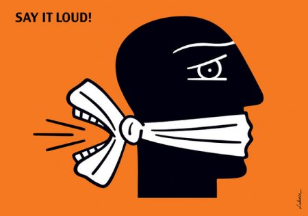
Say it Loud
The first poster I encountered in the exhibition, Say It Loud, was originally created in 2003 for an ad agency of the same name in Orlando, Florida, repurposed here for the Designing Justice theme. Other commissions in evidence include those from humanitarian organizations, other non-profits, universities, Broadway productions, Shakespeare plays, choreographers, and the War Resisters League. Lukova also has other diverse clients including Sony Music, Canon, Time, Harvard University and Verve Records (for the CD box set Ella Fitzgerald and Duke Ellington at the Cote D’Azur, which was nominated for a Grammy Award for best recording package design). Her work has won many awards and been exhibited around the world, and her posters are included in many significant museum collections, as well as the Library of Congress, the National Library of France and the World Bank.
Thematically, Lukova’s art exhibited here deals with social issues of fundamental fairness and injustice, inequality and illegal discrimination, immigration, war and peace, censorship, privacy, corporate corruption (yes, I see the potential conflict), and environmental concerns: i.e. our human condition on this planet. She believes that art is an existential requirement for humanity and sees morality and creativity as deeply aligned. And she believes that her art can make a difference. “It is easy to get discouraged about art’s ability to change the world when we see that abuse and injustice continue despite the creation of so much powerful art. It is impossible for art to fix a declining economy or stop all wars, but art changes the way people see and understand reality… If art were so innocent and benign, there wouldn’t be censorship.”
Stylistically, Lukova’s work is marked by an economy of line and color, bold blacks and color which often characterize silkscreen poster art, with the use of defined edges and articulated line often reminiscent of woodcuts. Typically there is only one color used, beyond black and/or white, often employed as a monochromatic background. Occasionally two colors are employed (I was startled upon encountering, almost at the end of my viewing of the exhibition, a poster for the 2016 Pride Parade in NYC containing an actual rainbow of six colors). Her influences are diverse “I’ve been definitely affected by artists like Picasso, Goya, Rembrandt, Chekhov, Shakespeare, Charlie Chaplin [and] so many more” (elsewhere she includes Käthe Kollwitz and folk art ) and her work has been compared to the German Expressionists, as well as Escher and Picasso. Her work’s deceptive simplicity and effective use of visual symbols and metaphors make it both powerful and accessible to most viewers (that special Bulgarian slant Lukova mentioned sometimes has classical motives appearing in her imagery), In fact it’s an excellent exhibition to bring even young children too, as it skillfully educates not only about the social issues the works address but how meaning is communicated through the visual symbolic language of art.

Human Race
All Lukova’s work begins with drawing, then she hand paints her posters with acrylic paint, later printed in editions as silk screen prints (serigraphs), using a computer only occasionally to “touch up” (“but this is when I’m preparing files for print,” she explains; “the actual image making is entirely done by hand.”) The full exhibition, installed on deep grey and yellow walls at the Freedom Center, is a feast for the eyes in forms and colors, assisting its engaging hearts and minds.
In 2008 Lukova released (through her own publishing company, Clay & Gold) her Social Justice portfolio of 12 large book-sized lithographs, each thematically titled illustrating a single social issue, commissioned only by herself; it has become a best selling, highly sought publication. The entire portfolio is included in the NURFC exhibition as poster sized serigraphs.
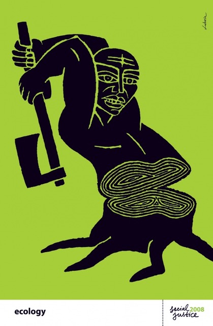
Ecology
I was concerned that the wall texts would too often attempt to explain the meaning of their posters. After all, posters are intended to communicate to the world – usually the world of the street, which can be anyone, not merely the art cognoscenti. And sometimes, this is a problem – the text accompanying a poster titled Water reads, in part: “Lukova’s art asks us to really feel what it’s like to love a child then watch it die.” Says who, which curator? I’d prefer to discover my own interpretation in the imagery. Having said that, there are some works which actually can use some explanations, when the symbolism is unfamiliar or the analogy unclear (it happens; the entire exhibition actually could benefit from being somewhat reduced in number of pieces, tightened so strengthened).
Chernobyl, Fukashima (2011) created for the 25th anniversary of the 1986 meltdown at Chernobyl in the Ukraine (based on the ancient Roman sculpture Laocoön and His Sons – who were attacked by the gods for trying to warn Troy about the Trojan Horse)
Lukova designed the exhibition visually as well, determining the wall colors of deep grey, American mustard yellow and white, intending, she says, “to direct the viewers’ attention by displaying some works on contrasting wall colors – I was looking for a way to unite the entire exhibition and yet keep the arrangement of each wall different and visually interesting.” She also chose which works would appear on which colors. And, unusually for a packaged traveling exhibition, she has added new work as she has produced it, so the 2021 exhibition at NURFC is not the same exhibition that left MoDA in Atlanta in 2017. I was pleased to see that several of the works that most interested me were also the most recently created.

Pimps and Johns
To give readers an idea of the popularity of Luba Lukova’s poster art, look at the range of venues which have presented this exhibition in the past few years since originated at Atlanta’s Museum of Design in 2017: four arts centers across the US, including the nearby Krannert Fine Arts Center in Indiana; the Museum of the City of Riobamba in Ecuador; the Thermos Foundation in Taiwan; Anders Park in Szczecin, Poland; the Billie Holiday Theatre at Restoration Plaza in Brooklyn; the Jewish Museum Milwaukee; the Kaohsiung American School Media Center, also in Taiwan; and now the National Underground Railroad Freedom Center in Cincinnati. That indicates broad appeal and effective poster art.

Delta Blues
Luba Lukova: Designing Justice closes March 22 at the National Underground Railroad Freedom Center’s Skirball Gallery. freedomcenter.org/designingjustice.
–William Messer