I would say that in my experience, The Contemporary Arts Center has not been the sort of museum much interested in exploring the tastes and talents of Cincinnati, let alone the Midwest at large. To do that might require, for example, regular curated exhibits of the artists of the region, and they haven’t done that. The trade-off is that the CAC can deservedly claim to be substantially cosmopolitan in their choice of artists and shows. But now they are co-hosting with Kansas City’s Kemper Museum of Contemporary Art a rich show they are calling “The Regional,” curated by Amara Antilla (with help from Stephanie Kang) from the CAC and Jade Powers from the Kemper. To arrive at the 23 artists shown the “The Regional,” the curators used a broad vision of “Midwest”—“the area that stretches from the Dakotas to Ohio, and from Minnesota to Missouri”; in “Regional,” it even dips down to Kentucky and leaves room for Pennsylvania. On the other hand, a number of the artists’ work seemed more rooted in the places where they were born—Hong Kong, Laos, Ghana, Albuquerque, Guatemala, and El Salvador—than in the 14 Midwestern cities where they currently live. In a show as deeply interested in how political issues are represented as this one is, it is conceivably of interest whose political issues are at the core of an artwork—and how it got there—though presumably it is unattractive if not unviable to think of such issues as being exclusively owned by anyone from anywhere.
The curators make it clear that they proceeded by “resisting the possibility of a shared Midwestern ‘style,’” though it is interesting how many common threads they found, if only in content matter and broad political outlook. One artist whose work conceivably epitomizes all that is best in “The Regional,” might be Yvonne Osei, represented here by a complex, ambitious, site-specific four-part installation. In four different places, she has dressed the rugged architectural columns of the CAC with fabric on which she has photo-collaged tight patterns (not always easy to read) of significant racial crises in America—and specifically, the Midwest. The design on the cloth of “Truth Through Her Eyes” (2021), for example, represents the gas station in Ferguson, Missouri, where Michael Brown stopped off before being murdered by the police in 2014. The columns Osei has dressed are often accompanied by rough and random lattices of woodwork, suggesting both destruction and hasty repair. In “Dressed in Nakedness” (2021), the viewer (a sharp-eyed one, anyway) would see more imagery designed to call to mind America’s recent racial past: a child holding, as Tamir Rice did, a toy gun that cost him his life, as well as other pictures contrasting white privilege with Black oppression.

Yvonne Osei, “Dressed in Nakedness” (2021).
“Dressed in Nakedness” is unique among Osei’s work at the CAC in that the cloth does not try to cover up the column but is slumped and gathered at the bottom, revealing much of the bare concrete above the cloth. The wall tag suggests that the purpose of this is to expose “the physical structure as a reminder of how blatant and structural racial inustices are in the United States.” And that may be. But I would argue that like a number of the wall tags—and indeed, some of the art works themselves—it goes too far and lacks nuance. For reasons that may not be clear, this part of Osei’s installation chose to reveal its constitutive materials more fully. It also softened them, for reasons also not clear, but surely interesting. The drapery reminded me of ancient sculpture, though never letting us forget the contemporary content. If the net effect is partly sexual, it is surely sexual in a complex way. Is the revelation intentional or merely careless—and if so, on whose part? We’re being asked—and perhaps even enticed—to come and look at something. The column is shedding its intense patterns of imagery as one might shed one’s clothes, allowing them to gather around one’s feet. While there is no hiding what the imagery suggests, as I have suggested before, the images of which Osei’s patterns consist are hardly blatant. One is drawn in, I think, both to what is soft and what is brutally strong, to work that makes no secret of its content, and yet holds onto elements of concealment as well as open revelation.
Other works seem to operate on the basis of the principle of invitation. Hellen Ascoli’s “Lake Lap” (2021) is a backstrap loom weaving that has then been collaged into an argument about the current administration’s stance on immigration. At its core is Kamala Harris’s devastating comment “Do not come.” But Ascoli plays with this, weaving “Knot Eater” right next to “Come Not.” And while the message is plainly intended as a critique of Harris’s directive, it is striking how much the whole has come to resemble a spider’s web. We may be told whatever a political figure tells us, but we are still being drawn in. The forbidding and the lingering invitation are both plain, and complicate and enrich each other. As the piece has woven in its lower left corner, “Swallow Your Tangle.”
Other works make their ask of the audience in far more explicit ways. Lorena Molina’s installation “Reconciliation Garden” (2021) centers around a pristine white desk with an open laptop (belonging to the artist for meditation and creation or an overseer briefly called away to attend to other tasks?) surrounded by live, lush greenery. The issue, it is made clear, is coffee—an unfairly divided Salvadorian landscape owned by a tiny minority, dominated by a monocrop, over whose fate a 13 year civil war was fought. The ask, however, starts with the wall tag, next to which is a second tag openly requesting donations to the Coffee Farmers Reconciliation Fund. Then as you round a corner, on the wall is written “HOW DO WE MAKE AMENDS FOR THE ACTIONS OF THIS COUNTRY?” The adjacent wall was practically covered with what must have been generally gratifying responses: “Let’s talk about it”; “Open up to the implicit biases within yourself”; “Lead with love”; “Prosecute those responsible”; “Eat the rich” (this was posted more than once). But there were also other kinds of responses, ones that I thought wished for things over which individuals could have no control or ones that responded to the question with admissions of limited potential autonomy on the part of the audience: “Shut up and listen to those who have been affected by this country’s actions”; “You can’t”; “Burn it all down and begin again”; “I have no idea”; “Kill your ego.”
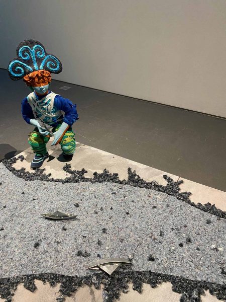
The installation made, I thought, an interesting decision in not telling or even implying the story of El Salvador’s brutal civil war. Throughout the show were many other works which showed a strong appetite to engage with narrative, expressed or implied. Jonathan Christensen Caballero works in what he calls “narrative sculpture.” In his largest piece, “Envios a Mi Hermano/Shipments to my Brother” (2021), two figures are arranged in a tableau at opposite ends of a low platform separated by a stream made of felted blue cloth, calling to mind a river. One figure launches simple children’s folded boats—here made out of silver metal—to the other. Some reach him; others have fallen over and will not. As the wall tag suggests, it seems to be a piece about the practice of sending remittances, typically from the family member working in the United States to family members back home.

Jonathan Christensen Caballero, “Envios a Mi Hermano/Shipments to my Brother [detail]” (2021).

Rachel Cox, “Suburbs [detail]” (2021.
Perhaps there is a natural closeness between narrative and unsettling narrative. In any case, Rashawn Griffin’s installation of eighty drawings that constitute his “Everything that happens” (2016-2021) works on the edge of what is designed to put us at our ease and what is uncanny. Each element in the total piece is a mixed media drawing, often with elements that are sewn, collaged, or patched. This lends an informal, improvisatory sense to many of the pieces, particularly when paper is pasted over the base drawing in order to alter the drawing or the accompanying text, where we often see erasures or preliminary drafts. Many of the drawings seem designed to capture the complexity of our casual impulses. In one, we stand in the shade looking down a narrow, outdoor passageway. There are a few black windows to our left, and on the right, flowers of some sort cascade into the pathway. But in the distance is the end of our view to which everything narrows, and it is nothing but a black spot. The text reads, “It wasn’t the best idea, but proceeded anyway. There was simply too much to do.” In another, two figures in silhouette walk arm in arm, possibly on a flower-lined path. The text is where the complexity resides: “That hurts, let it go. You’re the best!”
Griffin loves to build up his images on the ease of creating contradiction. In one, we see a glorious landscape with tall pines, bright sun and distant mountains. The text says “Sleeping is the most dangerous thing.” Dangerous because we are to imagine the difficulty of finding shelter, or dangerous because it takes us away from the one place we can rely on, the envigorating world of forest and hills? In another, we are indoors in an apartment with a fluffy, well-made bed in the foreground. But the wall behind is dark, and the bright window behind and above the bed seems barred, as they can be in basement apartments. We are told simply, “There was nothing we could do.”
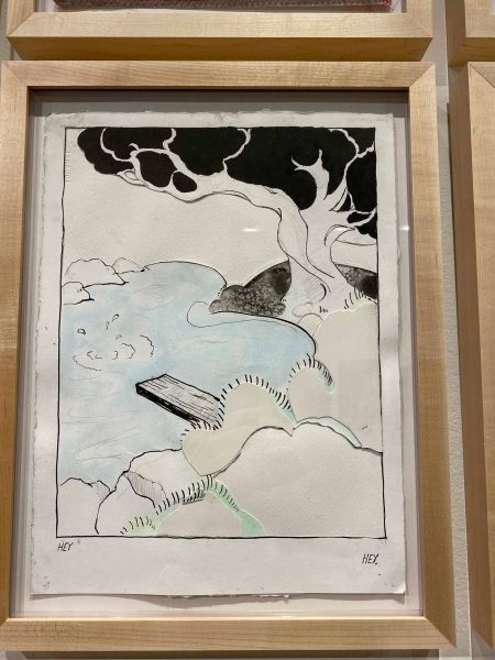
Some of the images seem to use their unsettling power to raise fundamental questions about the self. In one, we find ourselves on a city street, looking across at the shadowy backs of a building and some walls. The text here evokes a dream, but one that makes us wonder about what we mean by our identity: “Why I had to run I didn’t know… No one noticed, so I left. In the basement, there were two others with me, and I was outside of myself. In the new outfit. They wouldn’t find me that way. I wore a shirt of myself.” It is perhaps typical of Griffin’s work that there are in fact no figures and no basements to be seen. It is as if this one celebrates the invisibility of the self, having made its escape, but at the cost of wearing “a shirt of myself”: the self and the the costume, the disguise, are impossible to distinguish. Griffin can extend this sort of twilight, dreamy mysterious narrative even to the images that seem on the border of comic. In what looks like a comic book drawing, a small diving board extends over a pond somewhere in a cheery woods. Bushes and small hills are indicated by paper pasted in a layer over the base layer. A figure, presumably, has just jumped in; we see the splash, and there is a text right below: “Hey.” There are no other figures to be seen and no evidence of their presence except for the caption at the opposite end of the frame: “Hey,” said by no one.

Rashawn Griffin, “Everything that happens [detail]” 2016-2021.
I wouldn’t want to lose the overall effect, which is that we are being asked to follow–and perhaps take on faith—a grave story, which is both being revealed to us and concealed from us. But the net effect is also significant, which is that the solemn procession of cyanotypes is beautiful. There is a kind of mystical energy required to help the individual cyanotypes migrate from purple to cochineal, and then each image, as they become more readable, has its hint towards a greater awe, one in conversation with the rugged land of the Southwest and its broad and looming shapes. I mention all this because I thought that beauty was an essential element of the show, one which the wall tags either ignored or chose to be at odds. It is trying to bring some of that beauty back into view, even as we may choose to raise questions about it, that I want to close the review.
Lyndon Barrois Jr.’s “Brown Paper Flag Test” (2017) is a clear reminder that beauty can be a part of a work’s political content and argument. The piece is based on the brown paper bag test, which was used by Black social groups to determine whose skin color was sufficiently light to merit special privilege, and which has clear roots in preferential treatment due to skin tint during the period of slavery. The goal, of course, was to demonstrate skin color that was the desirable set of shades, namely lighter than a brown paper bag; Henry Louis Gates Jr. writes about his experiences with the test while at Yale, and Spike Lee brings it into his movie School Daze. Barrois has turned the bag to a flag, presumably as a reminder that this discrimination would not have currency among Black groups if it did not first have currency nation-wide. I merely want to add to this a closer look at Barrois’s flag. The stripes are multicolored; they could be wavy versions of a Kenneth Noland painting. I think this allows Barrois to raise a number of interesting additional questions. He might be wanting to suggest that there is a relativity amongst all colors. He might also be expanding the critique in some ways, suggesting that we are fated to be lost in our love of colors, and to remind us that our interest in beauty comes at a price.
Huong Ngô’s installation, “And the State of Emergency is Also Always a State of Emergence” (2017) is designed to explore what the wall tag smartly summarizes as “the material, spatial, and sensorial relics of Huong Ngô’s 18-month stay at a refugee camp in Hong Kong as a child.” There is a larger-than-life-sized model of a bunk bed, this one made out of graphite-coated paper, calling attention both to the sparse lifestyle afforded in such a camp but also, I think, to the innate sculptural nature of the world around us, the powerful, three-dimensional presences of our world. There are unpainted plaster models of canned food stacked in several places. We are told that they became a kind of tradable currency in the camp but, like the bed, they are interesting in themselves as well. They are freehand–no two seemed the same although the objects they represent were surely mass-produced commodities. But as the artist revisited the ordinary, she could not help individualize its elements.

Huong Ngô, “And the State of Emergency is Also Always a State of Emergence [detail]” (2017).

Margo Wolowiec, “11 Cities” (2019).
My first thought as I toured the show was that it was an exploration of fiber art, because I encountered early on the work of Osei, Ascoli, and Margo Wolowiec’s magical weavings. The one called “11 Cities” (2019) is set up as a three-leaf screen. This creates the impression that it is a domestic piece; it already has a place. And it needs to be said that it’s beautiful, by any standard I can think of. It glitters, it ripples, it reflects light and it depicts dappled light being reflected. But there is also a restlessness as its core as you come to see that two of the three screens are not just about water but are effortlessly, almost invisibly, divided into bands of different waters (presumably eleven). As the wall tag helps us see, these are each representations of the unsettled waters that surround or run through eleven of the world’s larger cities. One of the cities is Detroit, and it is impossible to think about the waters of Detroit without thinking about the contaminated waters of Flint. I could not help but find myself especially drawn to the artworks in a “Regional” show that addressed the issues that were themselves regional. Osei’s installation was another powerful example.
But then there is the puzzle of the third screen. If it too is water, I missed it, and while I freely confess to have missed many things in this show, it cannot be denied that the third screen is, at the very least, in a different register. It twinkles and dazzles; it is dappled but almost entirely in various shades of silver. It seemed to me it was an invitation to imagine water in a less contaminated way—in a visionary way that we hope that art will give us, at least from time to time. In the digital catalog, Wolowiec says “Each image and text that is translated onto threads takes on a new form, shifting and sometimes disintegrating, creating some breathing room and allowing extra time for digestion.” The third screen attracts us by its sheer, almost untranslatable beauty. Here, all water is clean, and in harmony with our world and our aspirations for it and for ourselves.
–Jonathan Kamholtz


